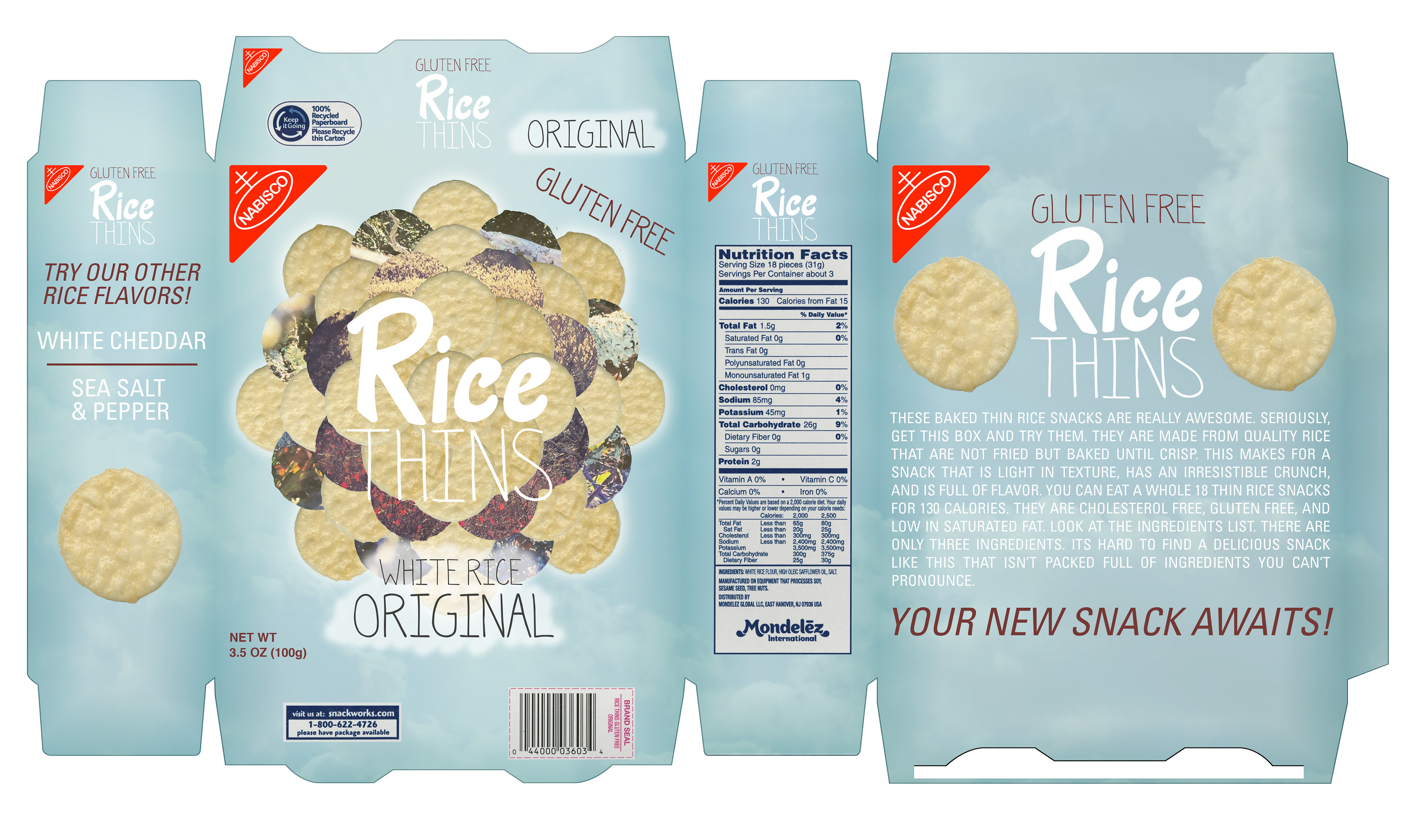
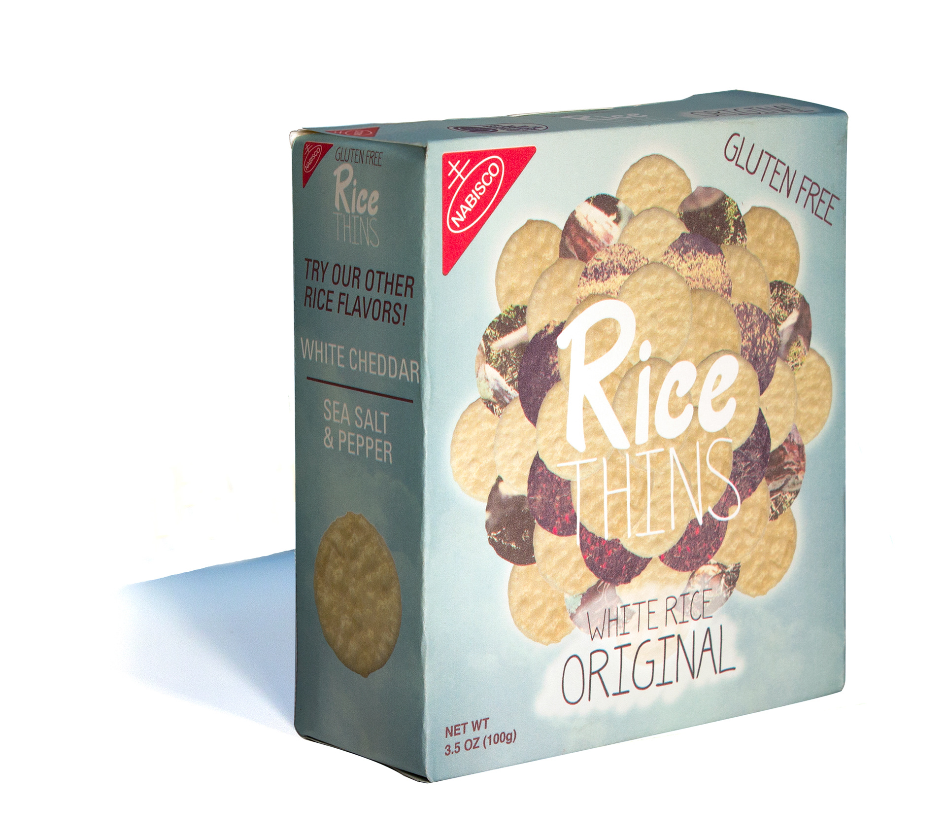
Rice Thins is a fairly new product made by Nabisco that sisters the Wheat Thins product. The original box and logo mirrored the Wheat Thins box and needed to have its own identity. I drew hand done type for the entire box except for using Univers for back and side of the box for easy legibility. I wanted to convey being light, healthy, and fresh. I took scans of the cracker and placed it in a circular pattern almost like a flower. I masked picture of nature over 2 layers of the crackers and put a highlight around it to make it look like it was floating. I made the box an inch short and 1/2” wider to be more hand held and make people feel like its a small easy snack.