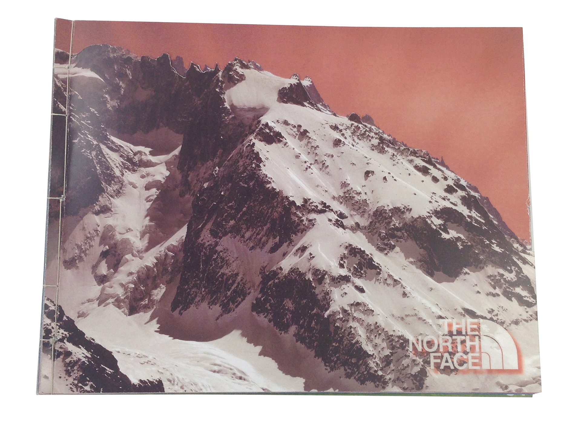

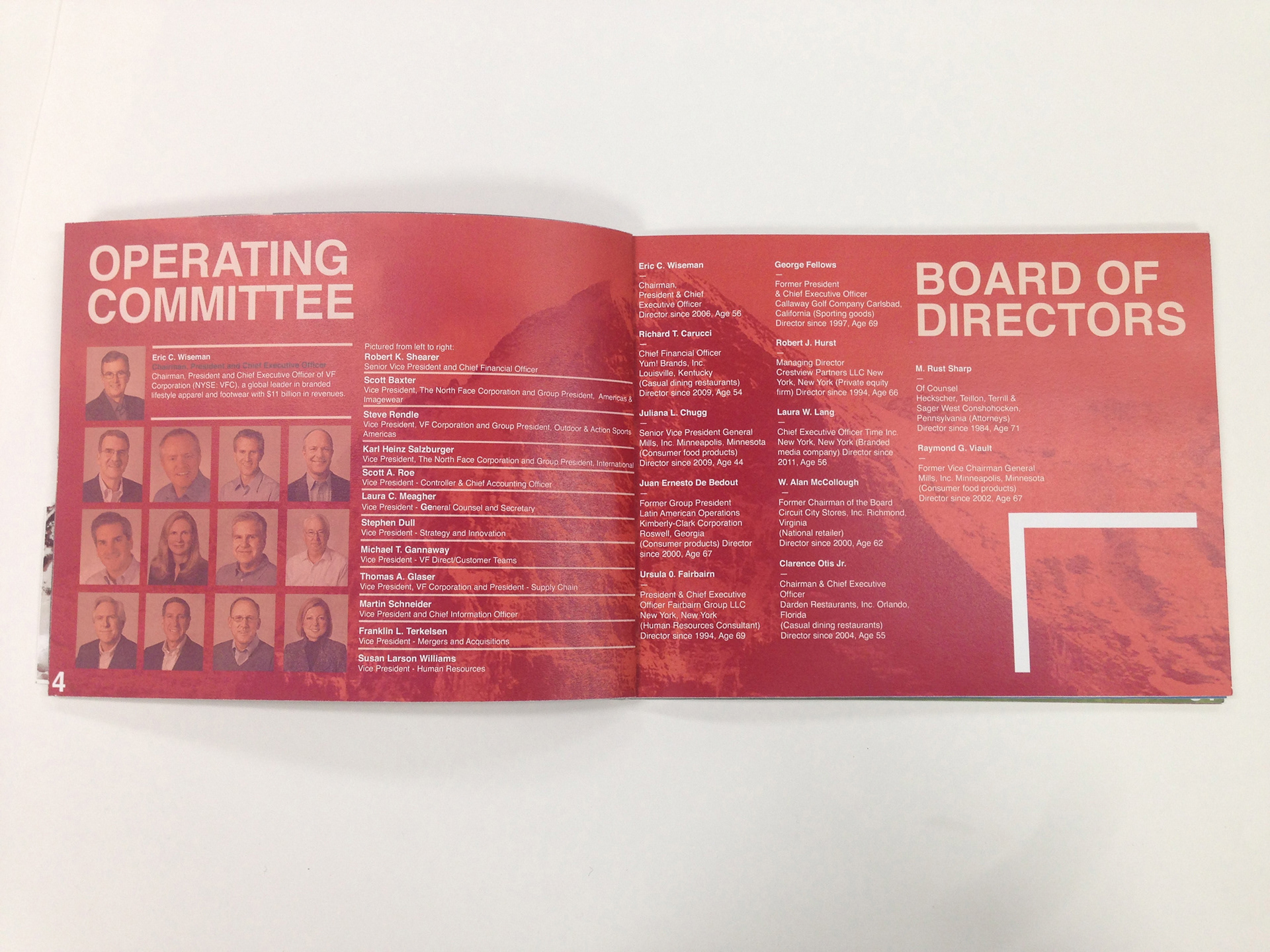


The North Face is a company that is edgy and goes to the extreme.They needed an annual report that was edgy, bold, and a represented their companied style. I looked at the North Face’s ad, web, and print designs to get inspiration and see how I could incorporate that into mine. I chose a cutout mountain for the cover because their company was started on mountain climbing and they are known for their extreme weather gear. Its all about getting to the top for them and climbing mountains to do it. I used a grid system along with corner marks to map out locations for type and pictures. The corner marks are a play off of the saying, “taking it to the edge”. I wanted sharp corners to give it that feeling. I used fun pictures and sayings to give the annual report the spunk it needed and I separated the sections by color, the signature North Face red being the primary color.