
Furnace Fest Apparel & Travel Case
Plug You Holes helps Sponsor Furnace Fest Music Festival in Alabama every year. The Sloss Furnaces where it is held is an iconic music venue that I wanted to represent in the design.
PYH Sticker Pack Promo Designs
Three sticker designs for a giveaway included in PYH's Billy Madison themed back to school sale. I drew these stickers on adobe fresco, made a sheet and cut paths on adobe illustrator, then printed them out on vinyl adhesive substrate using an HP300 Latex printer, then cut them out with the Graphtec plotter/cutter.
PYH Promo Video
Plug Your Holes video ad shot for current sale and promotional give-away. Coworker shot the video and I overlayed the text and graphics and added sound.
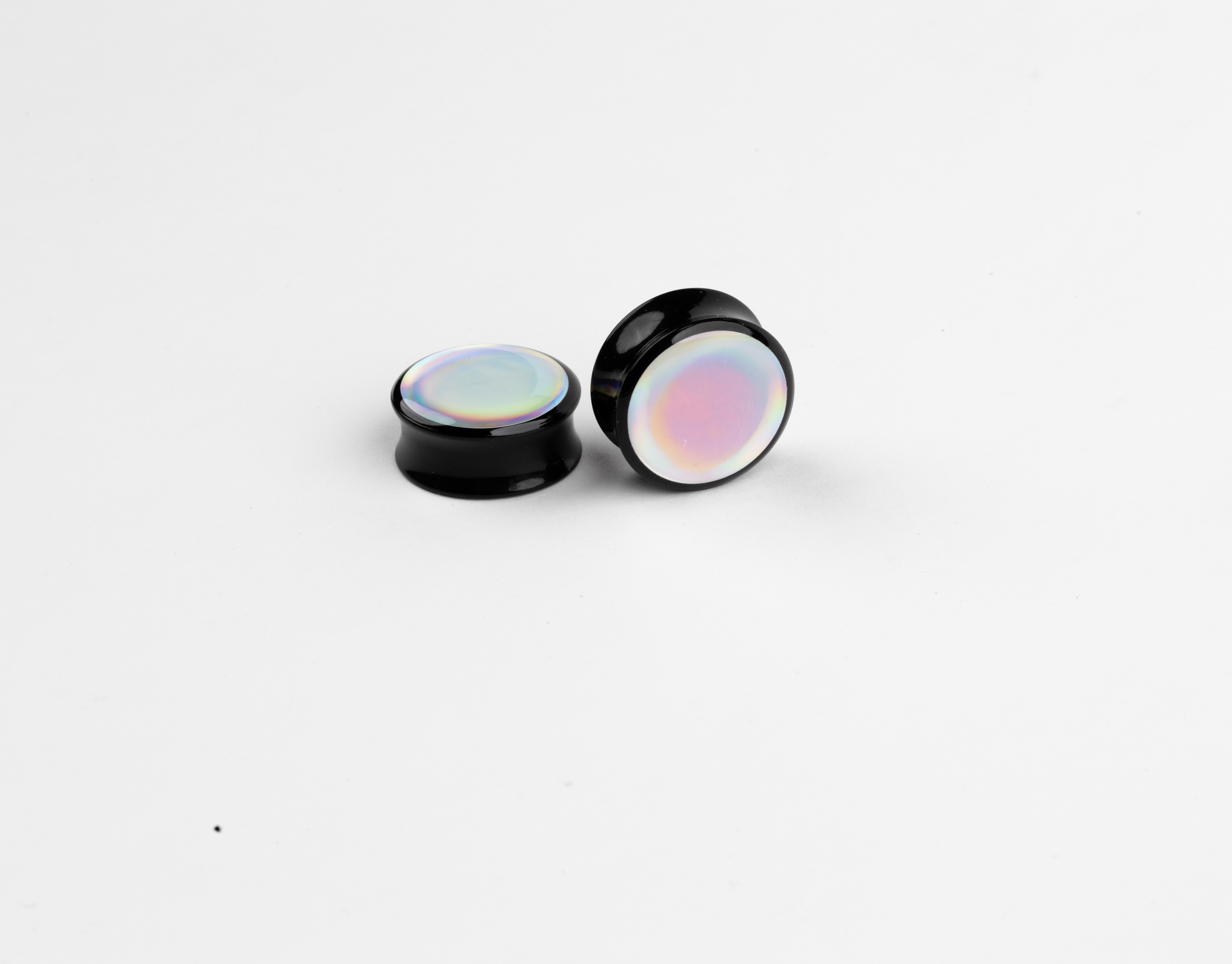
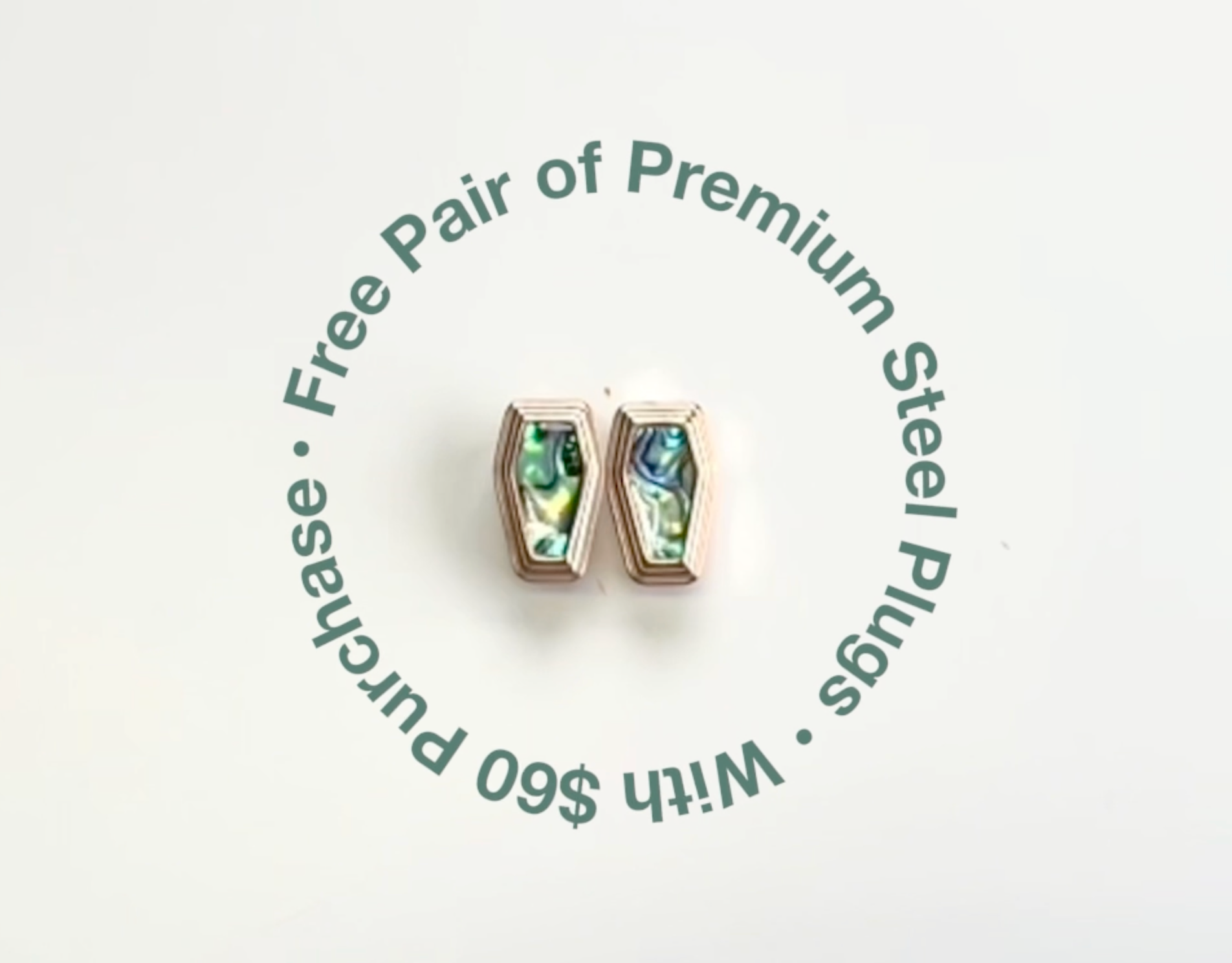
Reflective Holographic Rainbow - Plug Design
This is a Holographic vinyl adhesive substrate meant for printing purposes. It's beautiful on its own and wanted to show it off on some plugs that would go well with whatever outfit the person it wearing.
Using the holographic adhesive vinyl, I cut out circles, placed them on the dactylic gauges, then resin over it to seal in the image.
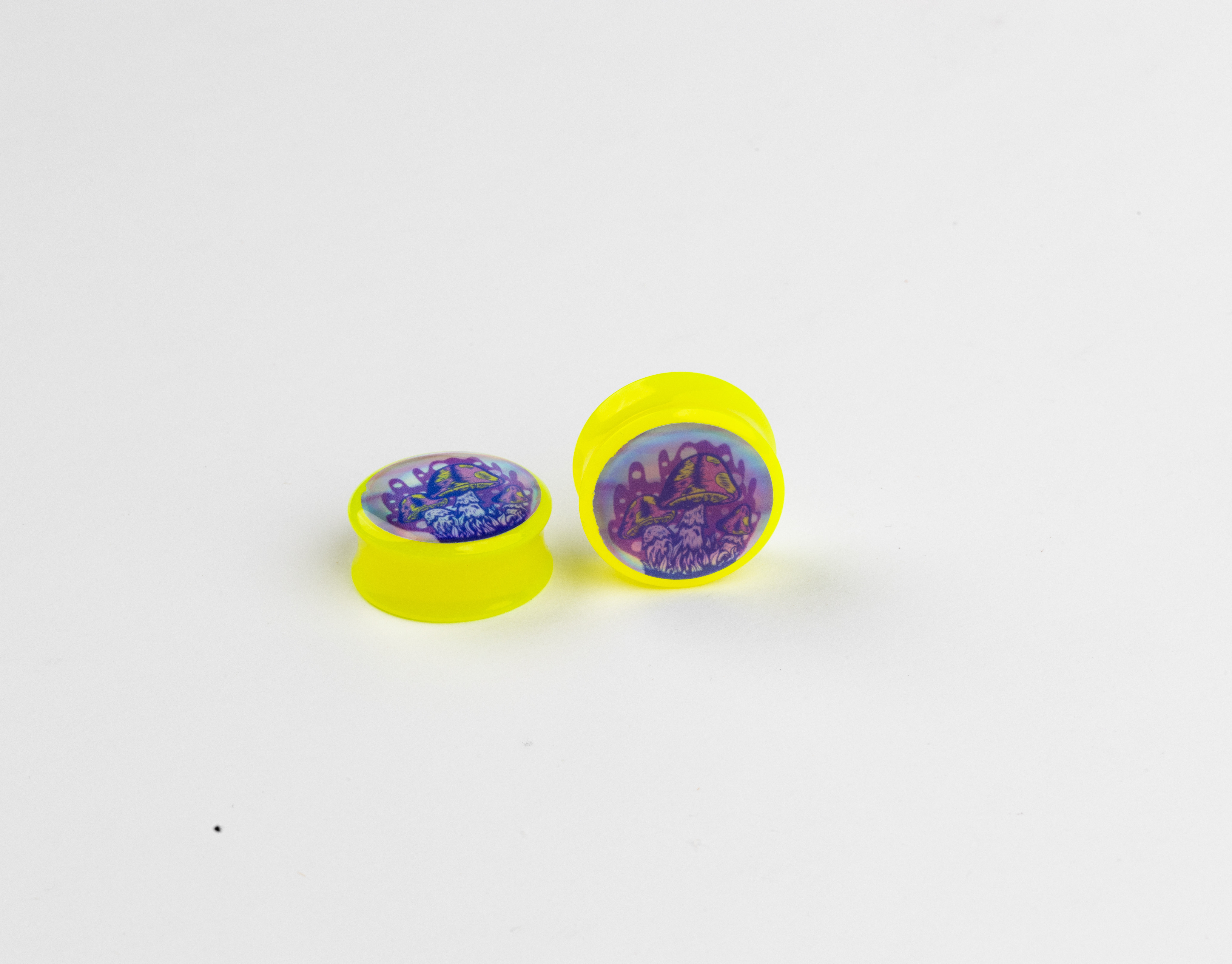
Holographic Shroom - Plug Design
Fun and funky little shrooms I drew for a new holographic adhesive substrate we acquired at work.
Printed on Holographic reflective adhesive vinyl, cut out, placed on acrylic gauge, then resined over to seal the image in.
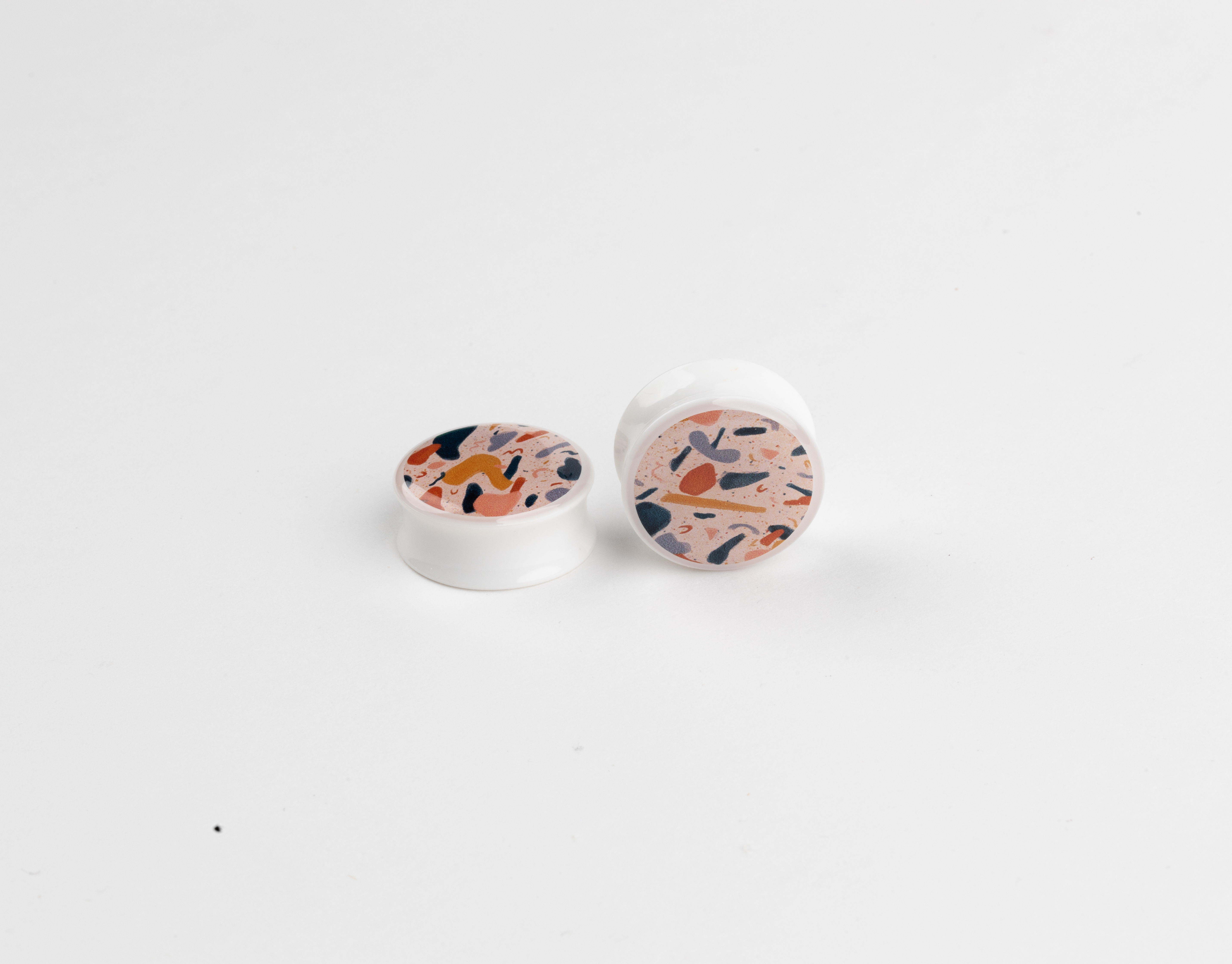
Funky Terrazzo - Plug Designs
I love terrazzo and wanted to bring the aesthetic without making actual terrazzo gauges. Using multiple brush pens and layering I was able to get the desired effect with and artistic touch to it.
The pattern is printed on vinyl adhesive, cut out, placed on the gauge, then resined over the tope to seal the image in.
PYH Holy Plugs
Sacrificial body of the plug. Just a little fun design taking inspiration from the catholic church.
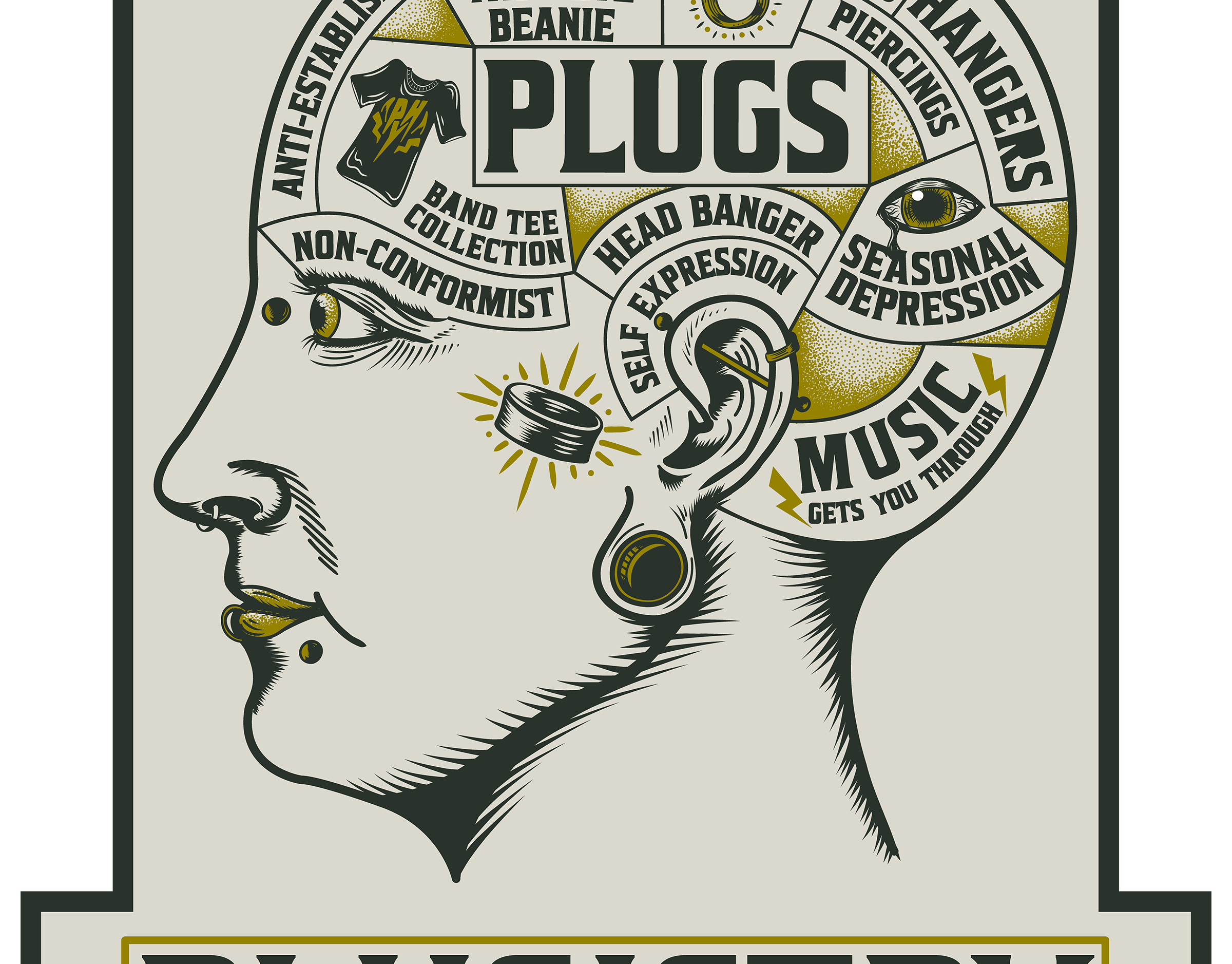
PYH Plugistry
A play on the debunked Phrenology. For the personality traits of the head I included aspects of plugs and the scene of the people who are our typical clients.
PYH Plug Baby
Making our mascot, "Plug Boy" a baby for April fools day sale. Ear Gauges/ Plugs for Babies was the concept for our April fools day sale.
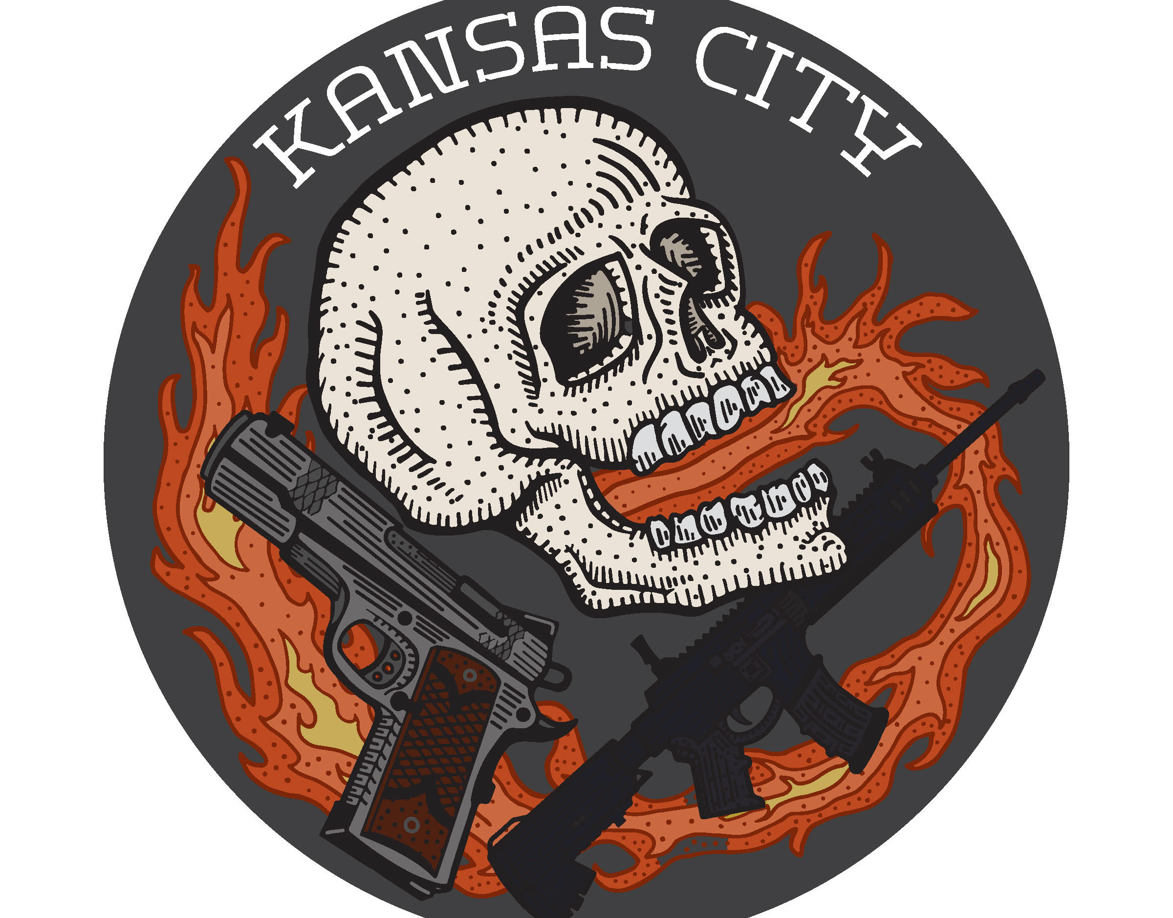
TJ & The TattleTales Shirt Design
A very short turn around project I did for a charity holiday show with TJ & The TattleTales. This is a holiday music event they do every year to raise money for Operation Breakthrough in Kansas City, Mo. They wanted something fun, yes holiday themed, but a little naughty. I drew one of the members relaxing on a bag of Coal, while the bassist is surrounded by the spilled coal looking little dazed. I used the style of "Shroeder" from Charlie Brown as the idea for the pianist playing all while his bandmates are getting into mischief. The bag reads, "To: Tj & The TattleTales, From: Santa."
Printed by Seen Merch in Kansas City
Stripe One
I digital illustration I made for my niece. Drawn on my iPadPro using an Apple Pencil and adobe fresco. This was printed and framed as a gift for Christmas.
Waddle To Me
This penguin was drawing I did for my nephew of his favorite animal. I printed and framed the illustration as a gift.

No Re-Horse
A little digital illustration I did for one of my nieces for Christmas. She's an avid horse rider and all around animal lover.
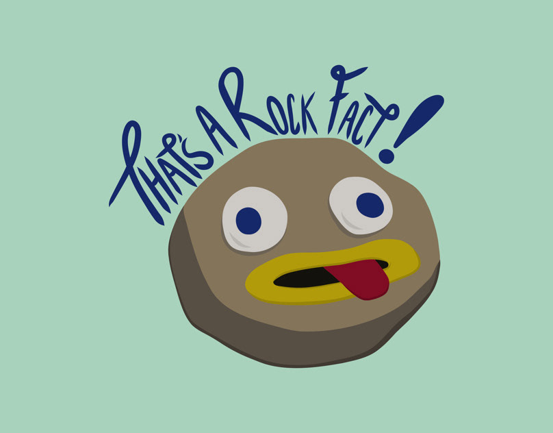
That’s a Rock Fact!
A most treasured rock from, ‘Over the Garden Wall’
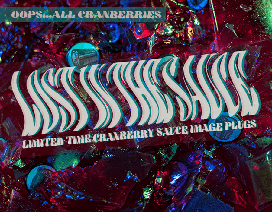
Cranberry Image Plugs Web Ad Design for Plug Your Holes
This is a photoshoot I did and Ad I designed for the Cranberry Image Ear Plugs I designed for Plug Your Hole. Every step that went into this product from start to finish I did. I designed the image plugs, made them, photographed them, edited to photos, and created the ad for our website. We had made a bunch of Jello for Our , "Oops All Cranberries..." November theme. I decided to take a fun shoot using the jello and multi colored lighting to get that trippy effect.
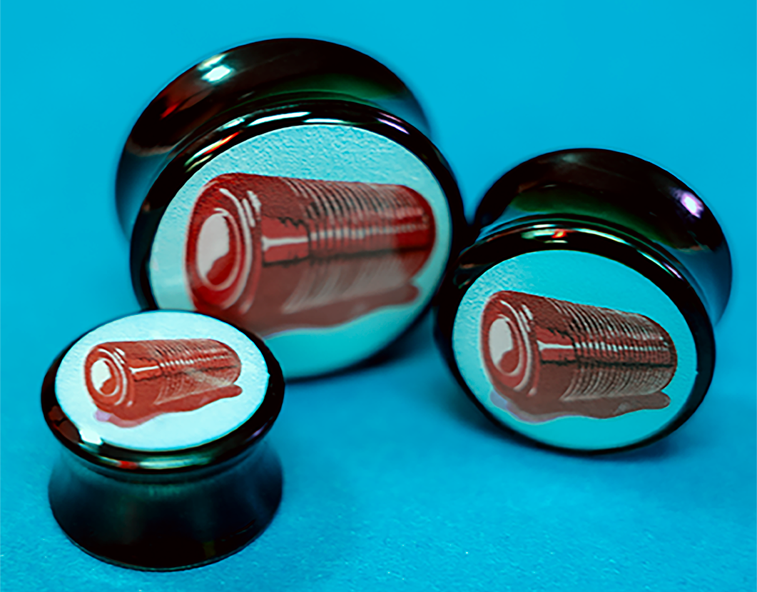
Cranberry Image Plugs for Plug Your Holes
Image plug design I created for Plug Your Holes. We did a cranberry theme for November as a nod to canned cranberry sauce so I drew an un-canned cranberry sauce sweating little. For this I drew the art of adobe fresco on the iPad, made the design into stickers, placed the stickers on acrylic ear gauges, then resined over the images to secure then to the plugs. I also took and edited the photos for the website.
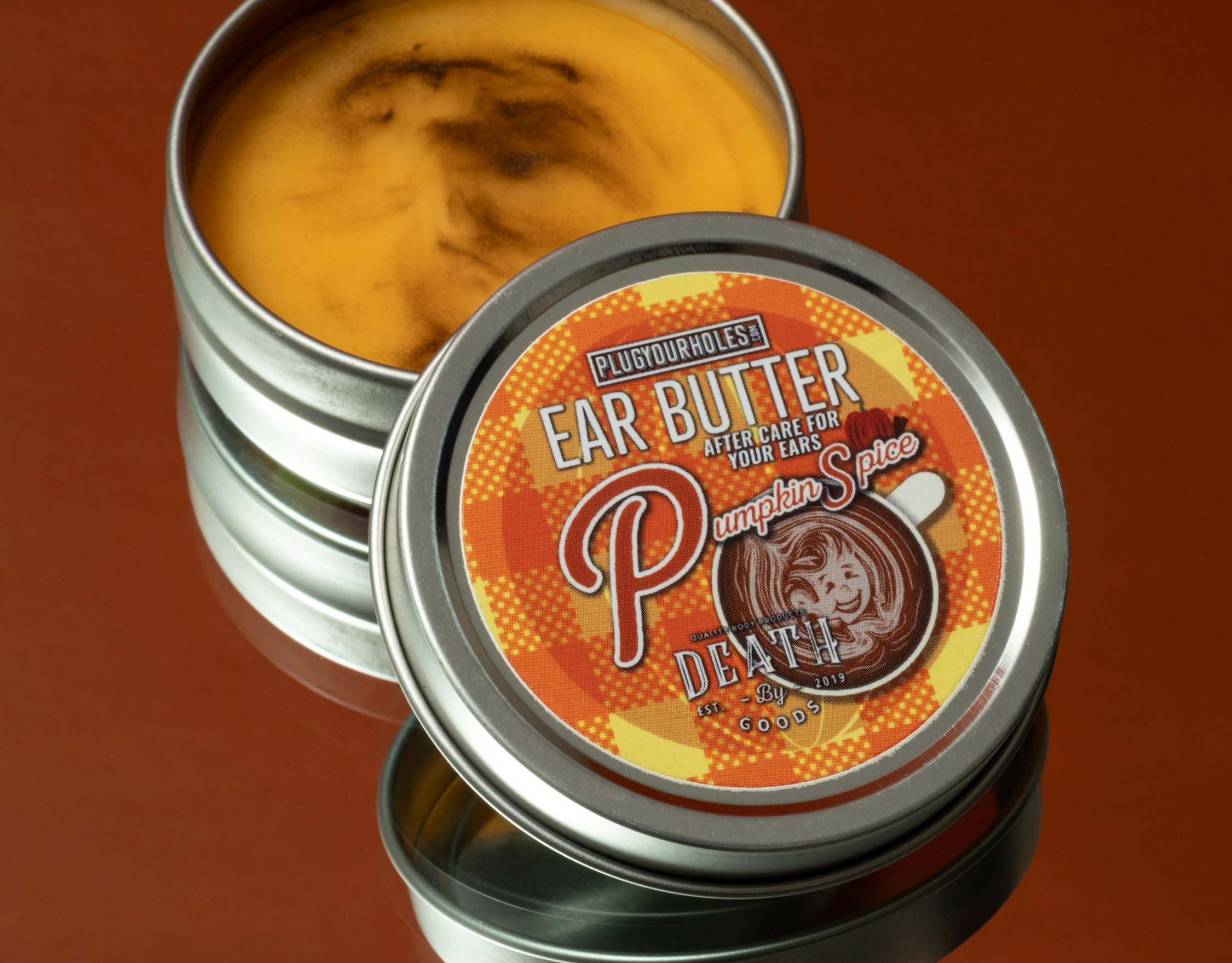
Pumpkin Spice Lip Butter Label for Plug You Holes
This is a label I designed for Plug Your Holes's very popular Ear Butter after care for people with gauged ears. The Theme was pumpkin spice for fall and I knew I wanted to make it more than your basic pumpkin or latte cup. I was inspired by latte art and…

Cranberry Lip Butter Label Design for Plug Your Holes
This is the second version of our new Lip Butter at Plug Your Holes. We wanted a fall flavor but not the normal pumpkin, pine, spice type flavors. One of my team members got the idea of cranberry from the beloved canned cranberry sauce. Since the first lip butter design was a melted stick of butter I decided to keep with that and go for a sweating un-canned cranberry sauce. I always go for a little weird in most of my designs permitted the type of design that is needed. This is a chapstick made after our most popular Ear Butter for people with gauged ears.
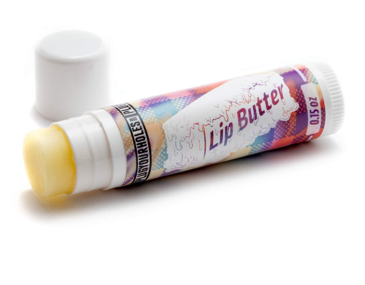
Lip Butter Chapstick Label Design for Plug Your Holes
This is a Label for the launch of our new Lip Butter at Plug Your Holes. We have a very popular Ear Butter for people with ear gauges so we thought we would make a lip version. The product photographed was the prototype and since the label has been changed slightly. In adobe fresco I decided to make it weird and draw a melting stick go butter then cut out the Lip Butter lettering in the stick. for the background I used the same plaid we use for our ear butter and put a funky design overlayed on top of it. I did not take the pictures for this product. I only designed the label.
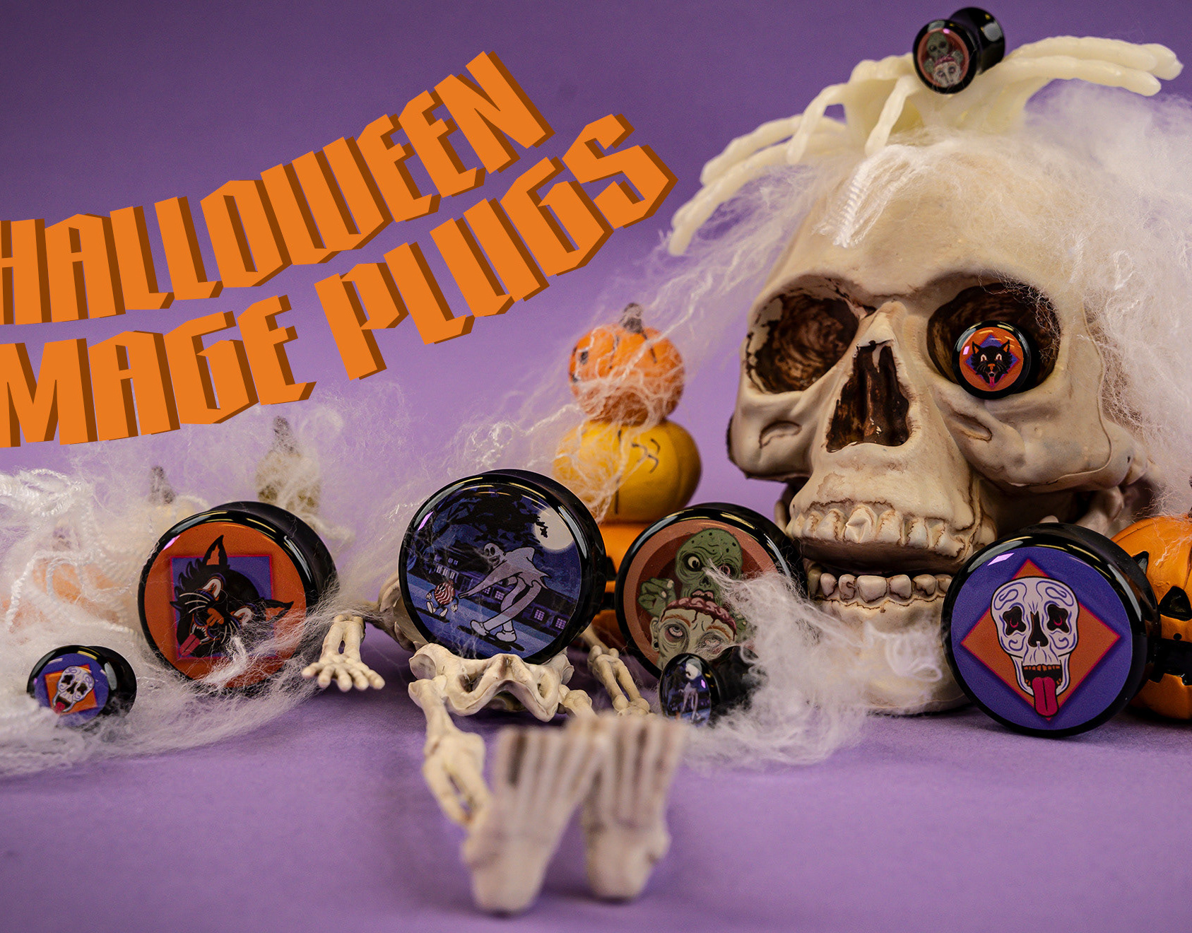
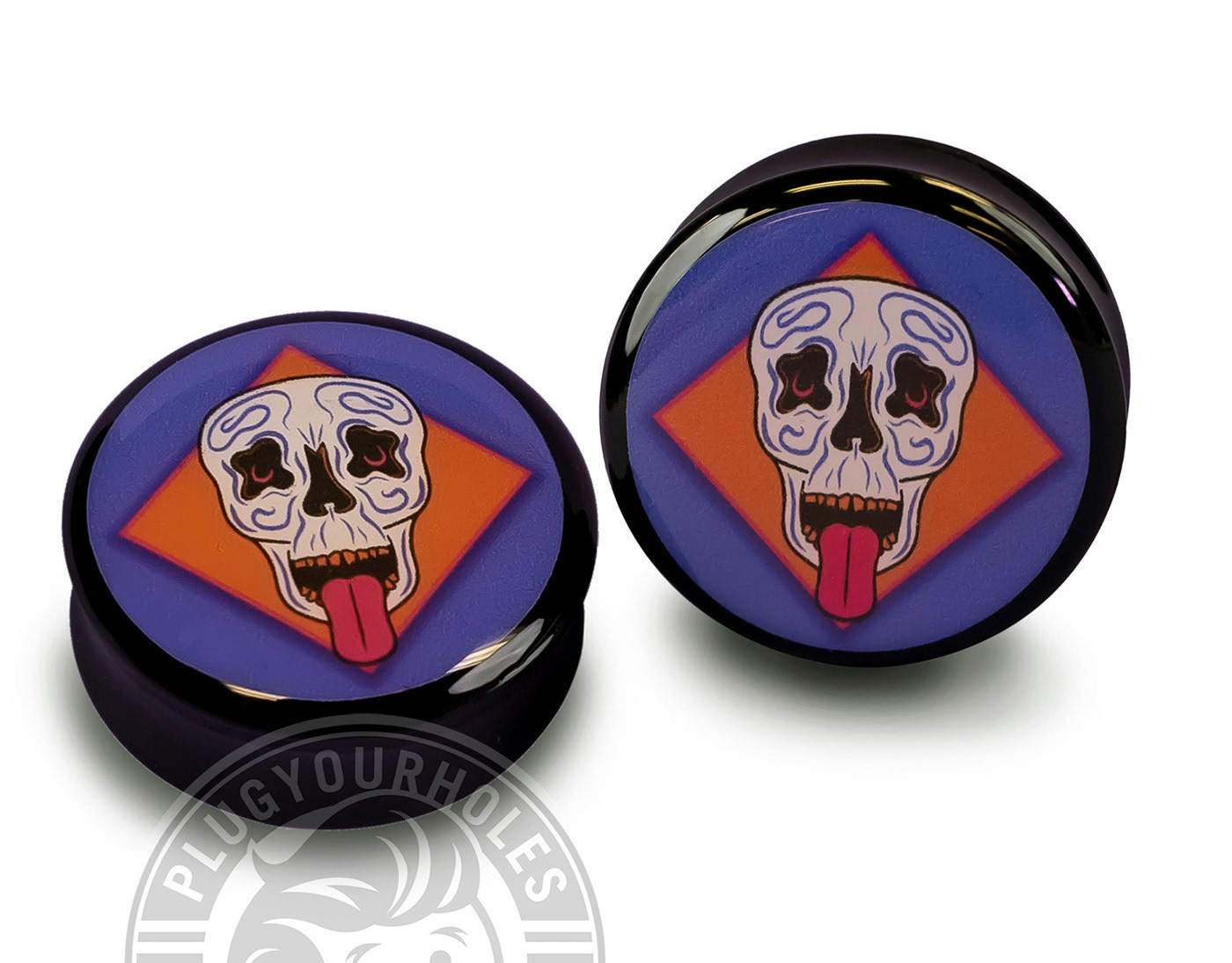
Plug Your Holes Halloween Image Plug Photoshoot
This was the small photoshoot I did and edited for a halloween image plug release for Plug Your Holes. These are image plugs that are worn in ears of people who have gauged ears. Along with designing 3 out of the four designs, I also make the plugs. After the design is finished we print it on stickers, place them on the acrylic plugs, then resin over them to secure them to the plugs. These photos were used for our website advertisements.
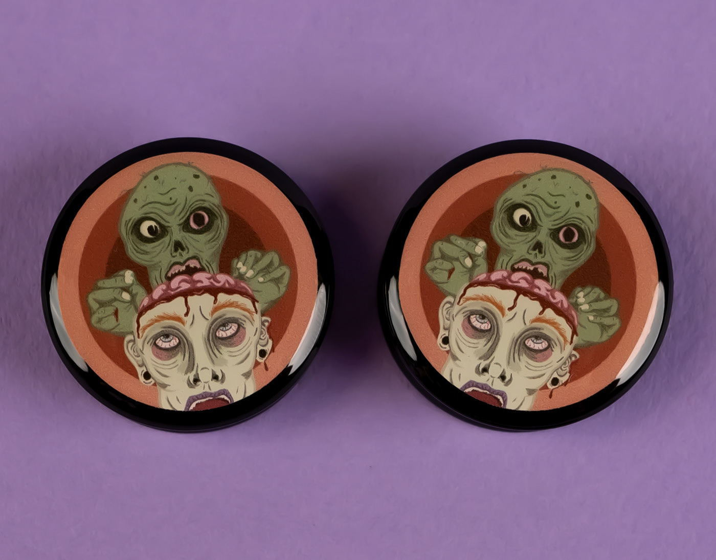
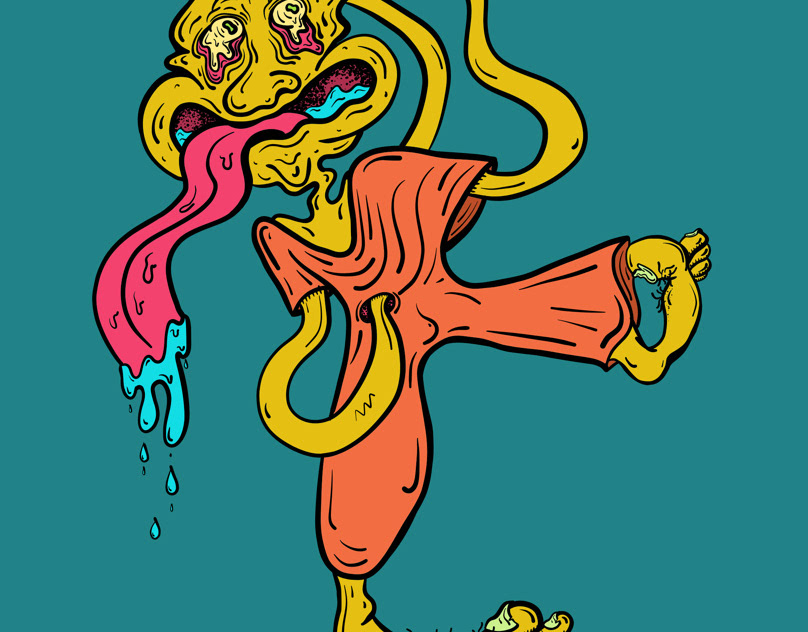
"Give Me Something Good To Eat" - Image Plug Design
Halloween Image Plug design for Plug Your Holes. This is a zombie looking hungrily over a persons head that have been opened to reveal their brain. After I make the image I print it on stickers, stick them on acrylic ear gauges, then resin over the image …
Lick My Bones Image Plug Design
Halloween Image Plug design for Plug Your Holes. After I made the image I printed it on stickers, stick it on an acrylic ear plug, and resin over the image to keep it secure on the plug.
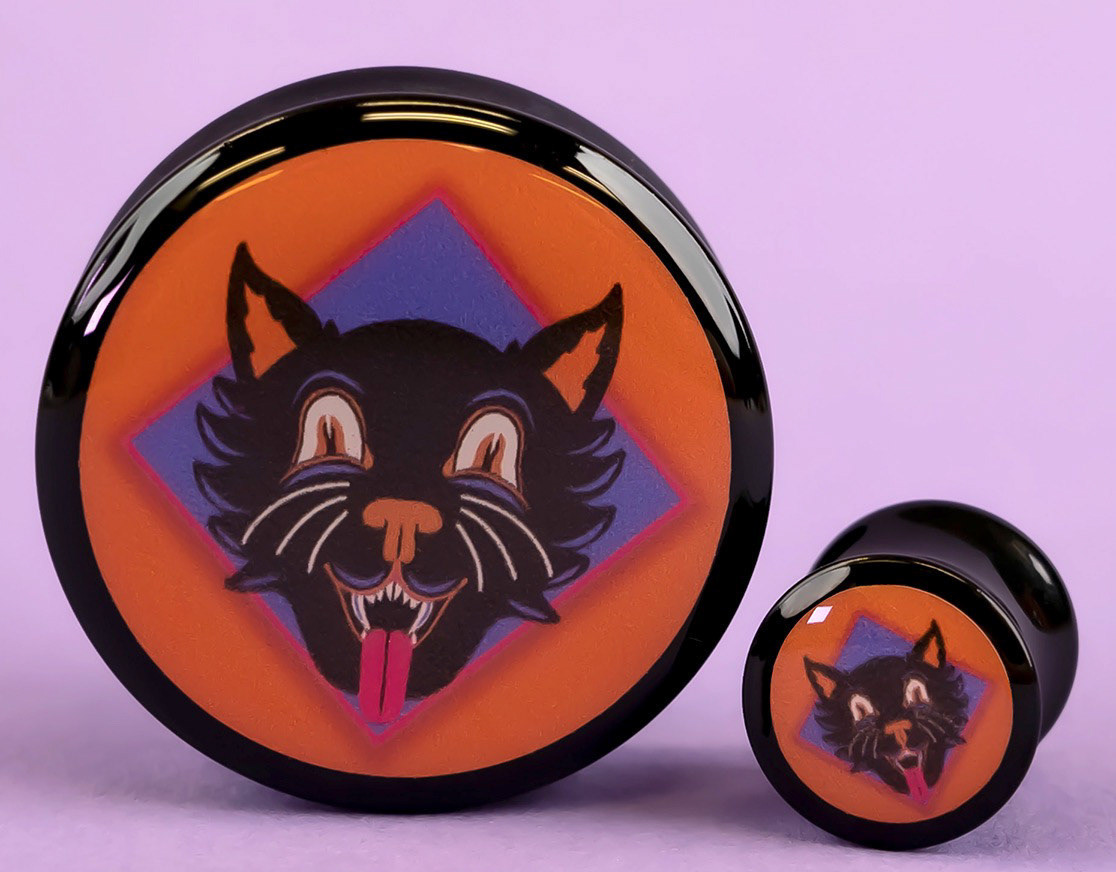
Cat Trick
Image plug artwork for Plug Your Holes. This art is for ear gauges "plugs". For Halloween I designed three different images to be used on image plugs. This is a cute little cate based of older halloween decor. For the image plugs we print them out, stick them on acrylic plugs, then resin over the image to keep them secure. I also did the photoshoot and editing for this product.
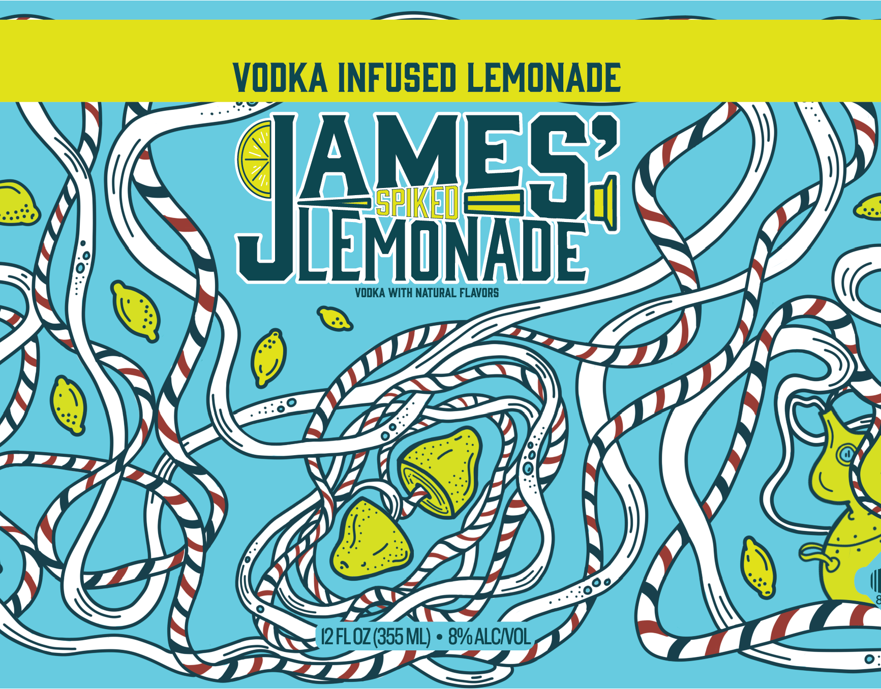
James Spiked Lemonade Branding
James Lemonade is a Kansas City Brand that has been around for a while. I was tasked a few years ago with re-branding James lemonade and giving it an overall facelift. I was asked to design the Spiked version Branding: Logo, can design, and packaging. Sin…
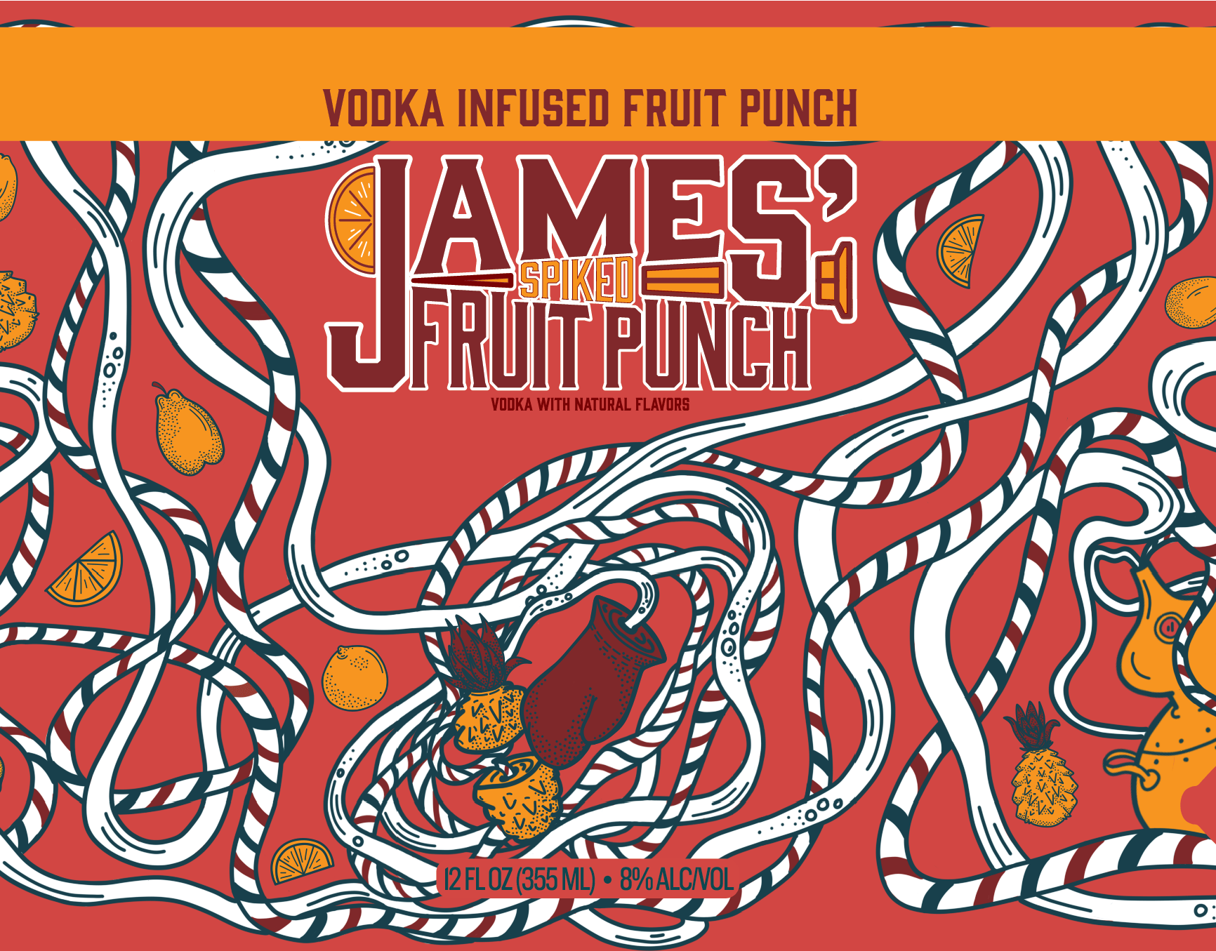
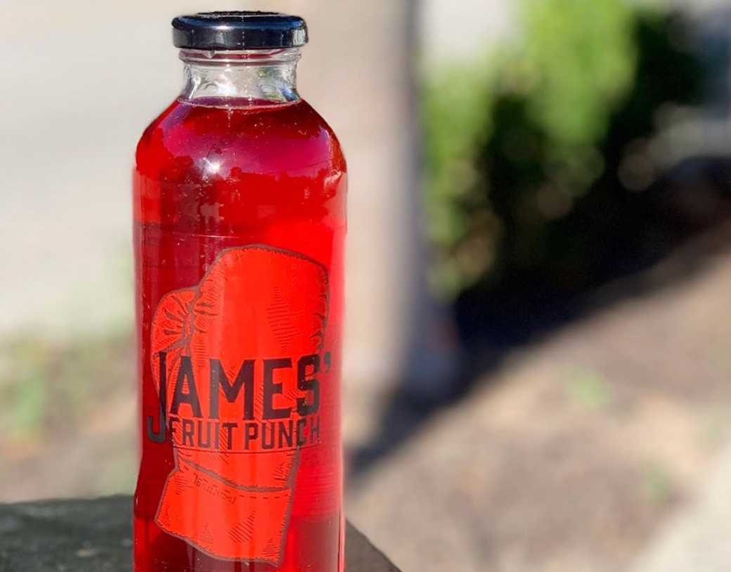
James Spiked Fruit Punch Branding
James Lemonade is a Kansas City Brand that has been around for a while. I was tasked a few years ago with re-branding James lemonade and giving it an overall facelift. I was asked to design the Spiked version Branding: logo, can design, and packaging for the lemonade and fruit punch versions. Since the drink is an alcohol "Infused" drink I decided to do a literal drawing of fruit being infused. I came up with straw like tubes to keep the eye going across the packaging and label. The red and blue striped is a nod to James of James lemonade. He started out as a barber before getting into the beverage game. For the Logo I used the same font and format as the original non alcoholic version and added a spike in the middle with the texted forming around it.
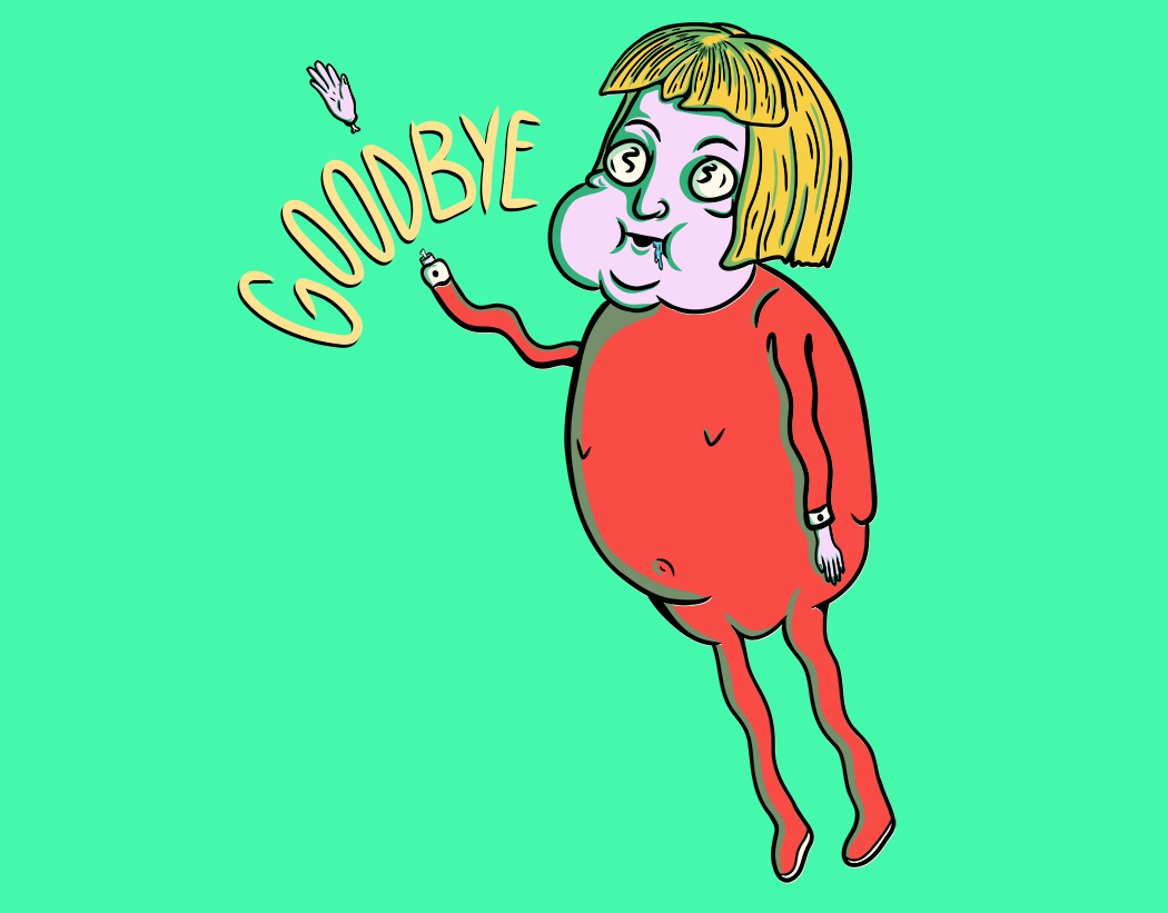
Wave Goodbye
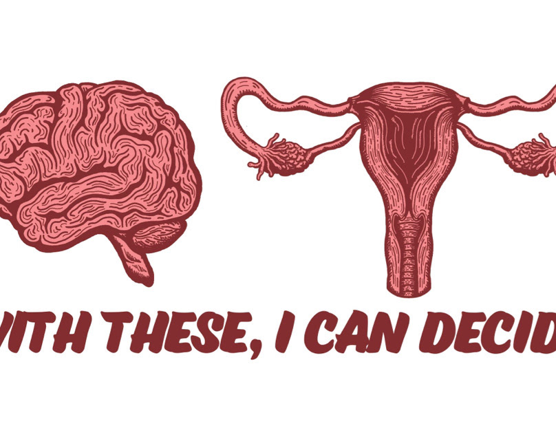
I Make My Own Choices
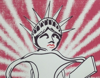
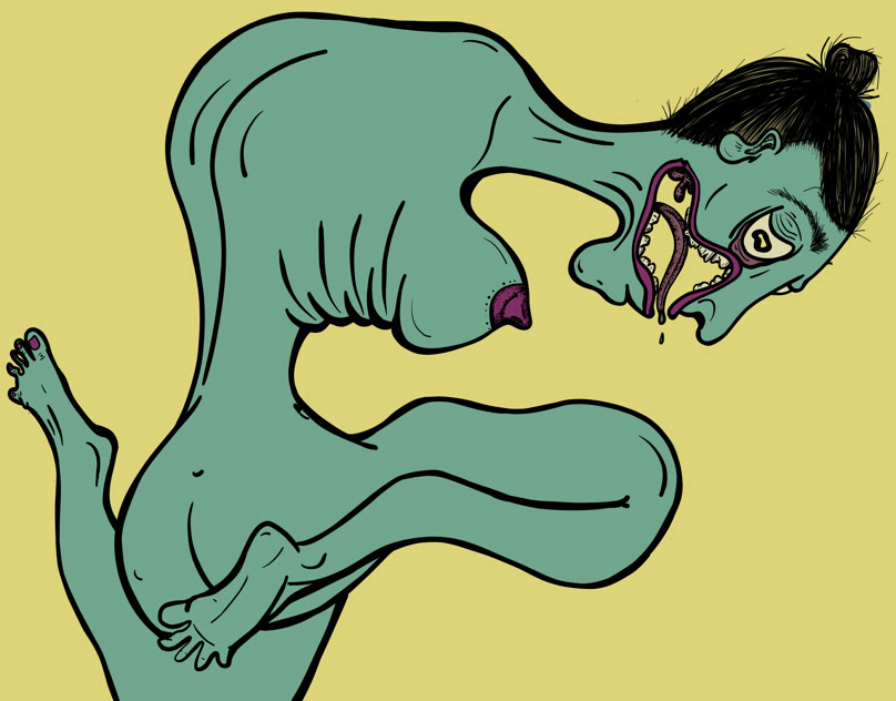
American Woman
A print I did of the statue liberty as a Uterus. I originally drew this for a class where we had to choose a controversial topic and make a poster for it. I chose woman's reproductive rights and made this poster. The Statue of Liberty is a symbol of freedom and hope in America, she is also a woman. I felt it fitting to draw her as a Uterus to play into the reproductive rights issue. It brings humor but also grabs attention.
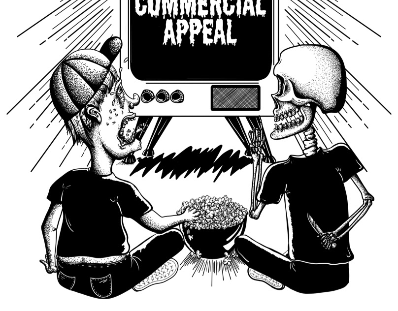
Commercial Appeal Gig Poster
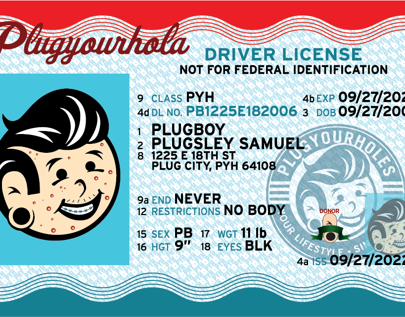
Drivers License for Plug Boys 16th Birthday
Our Company, Plug You Holes, turned 16 and I was tasked with designing a drivers license for our Mascot "Plug Boy." I used our vector plug boy and gave him pimples and braces to make him a real teenager. For the type t I didn't get direction so I tried to make it as funny as possible with a couple Easter eggs mixed in.
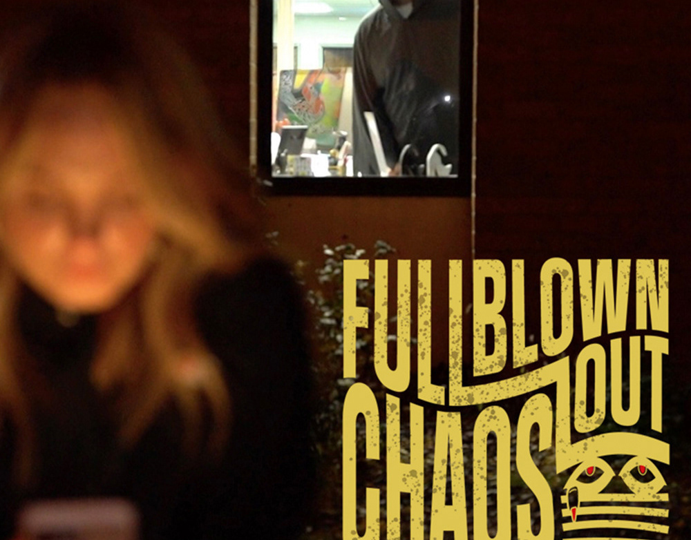
PYH: Full Blown Out Chaos
This is a Movie Title/logo I designed for a fake movie trailer Plug Your holes made for an advertising campaign. I had very short notice on this so I think I whipped it out in a few hours. I am a fan of Saul Bass so a drew a bit of inspiration from his designs and works. They were going for a little of an old school horror movie feel. I chose to try to make the eyes look like they are peeking through blinds to mirror somewhat the action of the main character watching their coworker through the window. I did not have a hand in the actual filming or editing. Just the Title/logo to be used.
James lemonade Label Design
Label design for James Lemonade in KCK
James Fruit Punch Label Design
Label design for James Lemonade fruit punch flavor
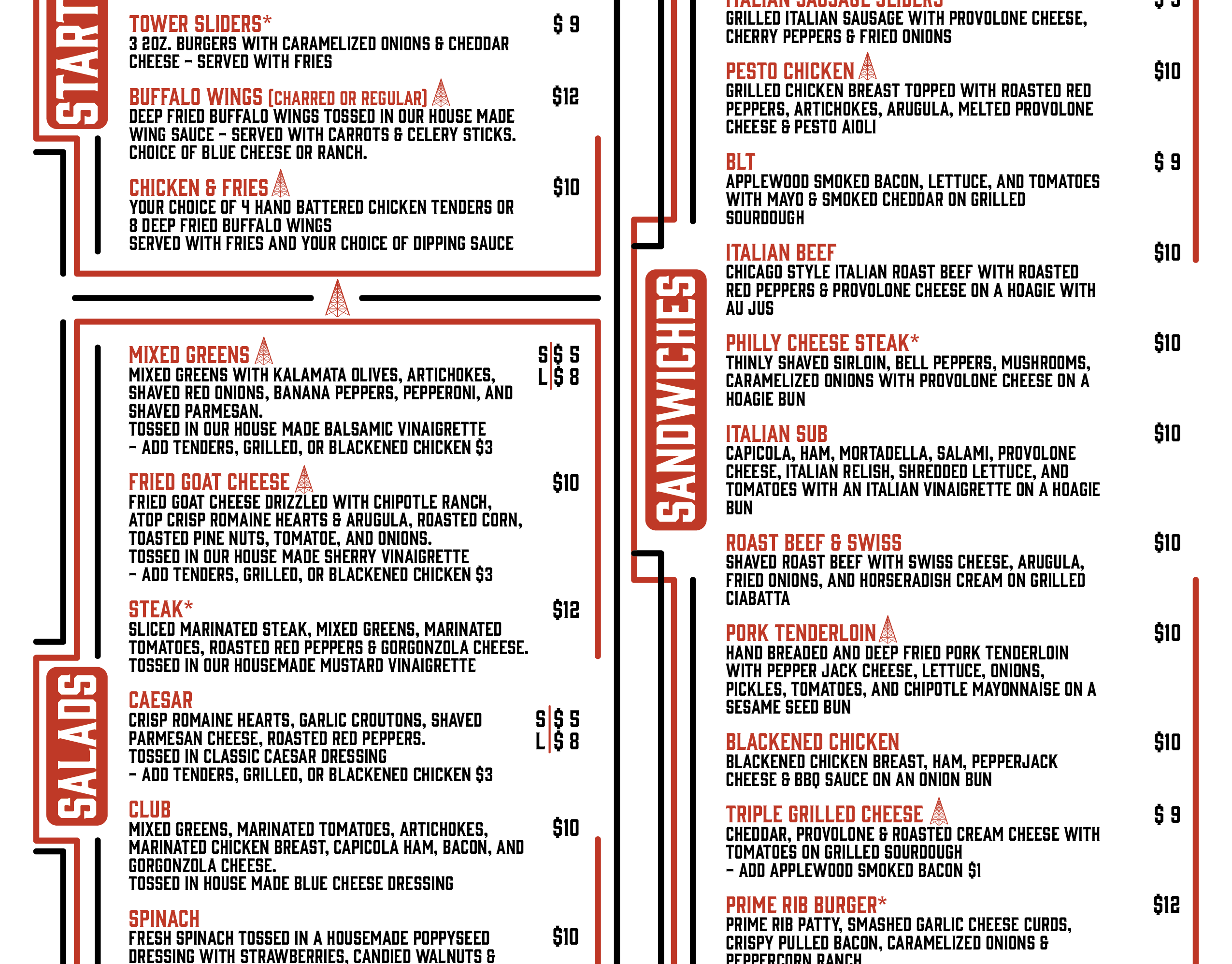
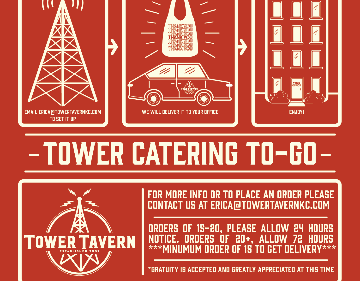
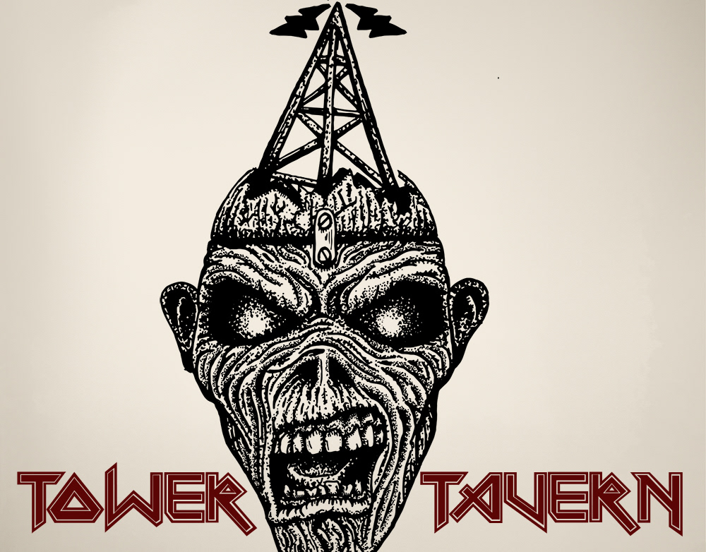
New Menu Re-Design for Tower Tavern
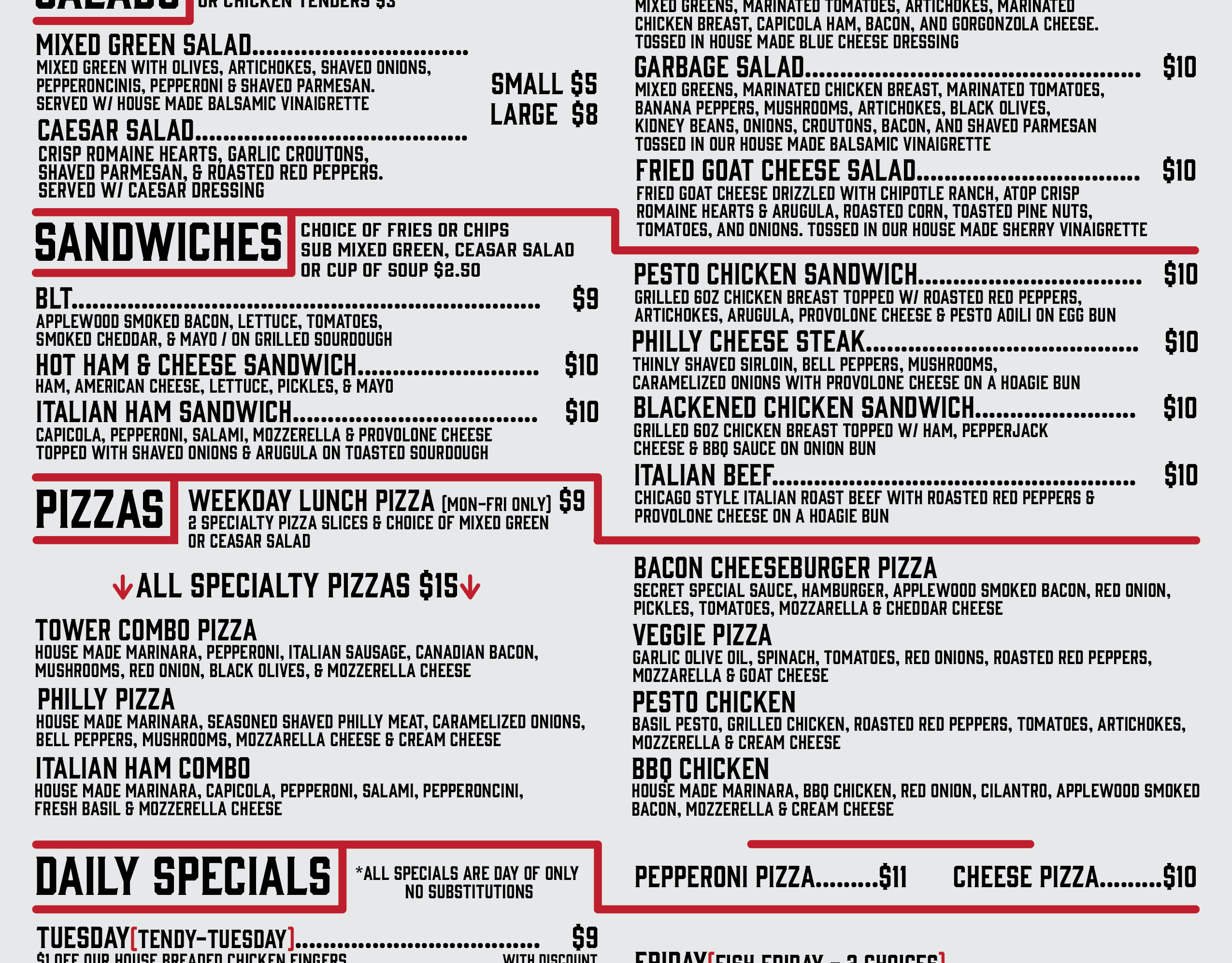
Menu Design for Tower Tavern
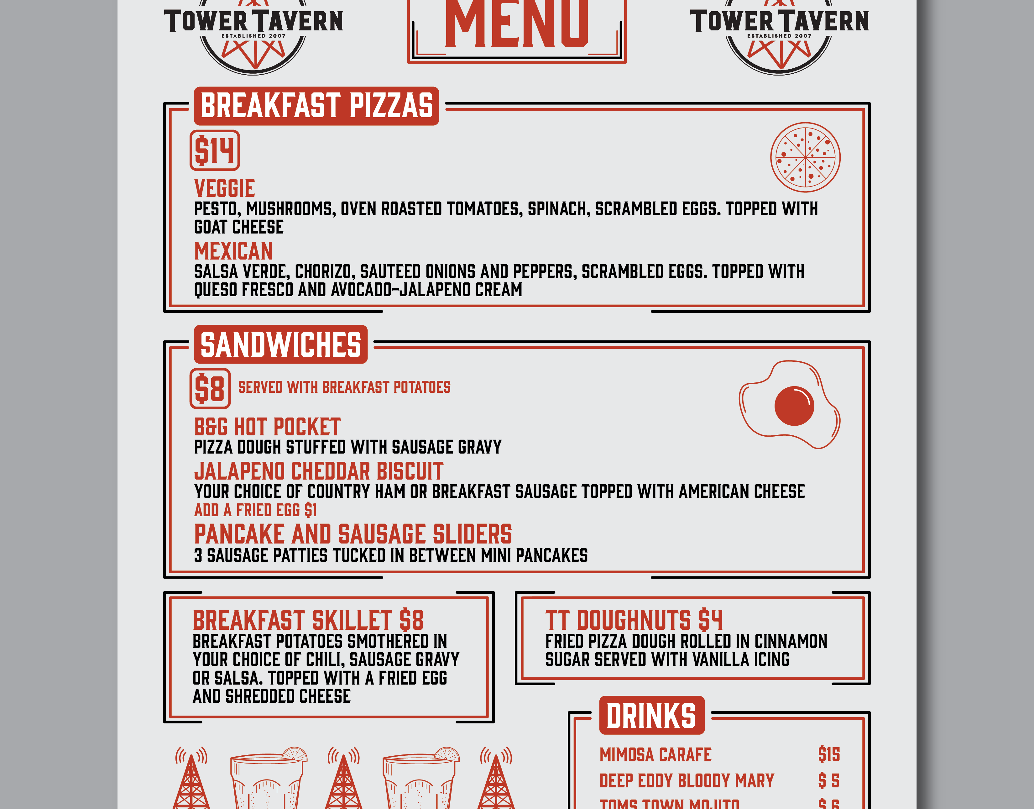
Brunch Menu Design for Tower Tavern
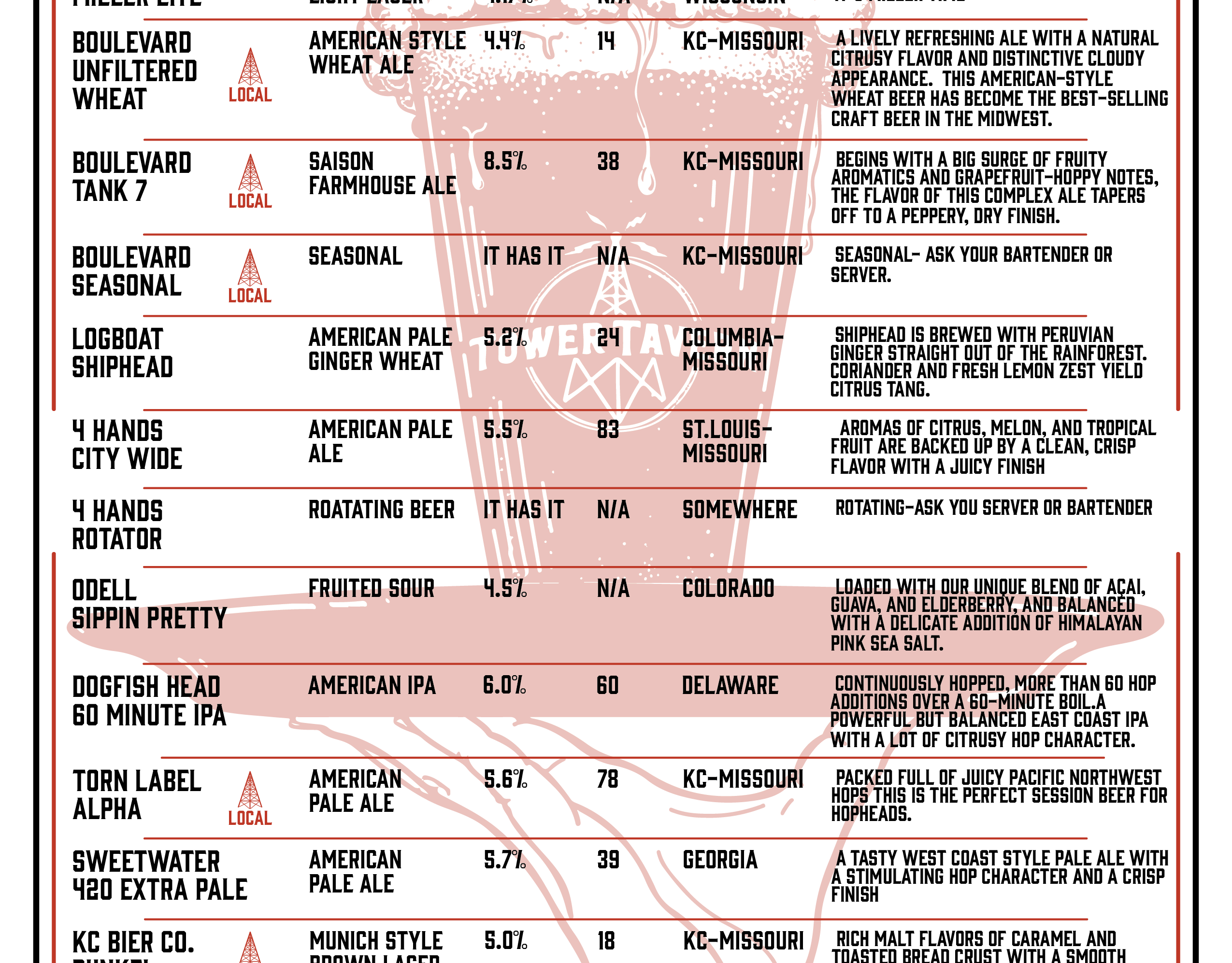
Beer List Re-design for Tower Tavern
See
Tasty
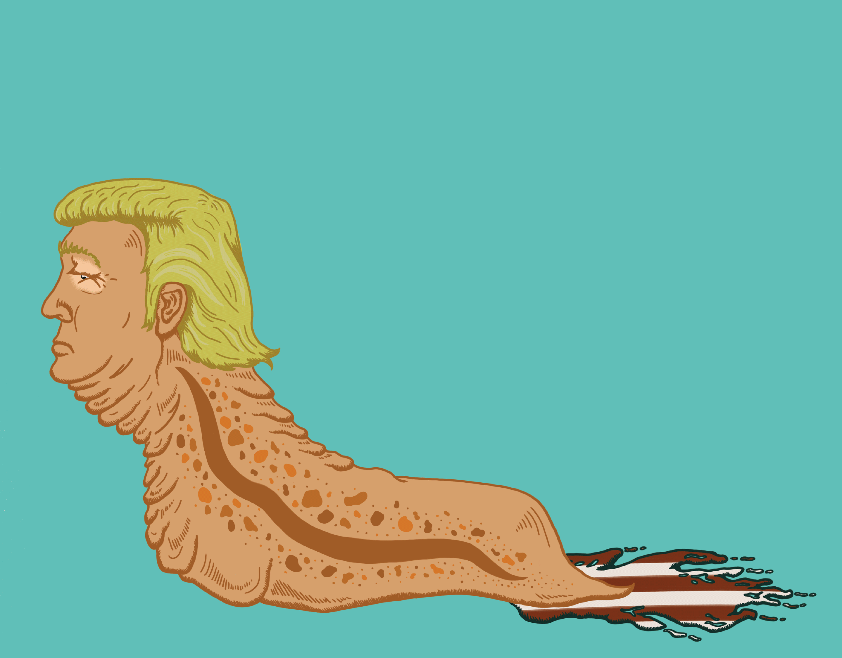
Trump Slug
A Gif I made for fun inspired by our one and only slug of a human being President.
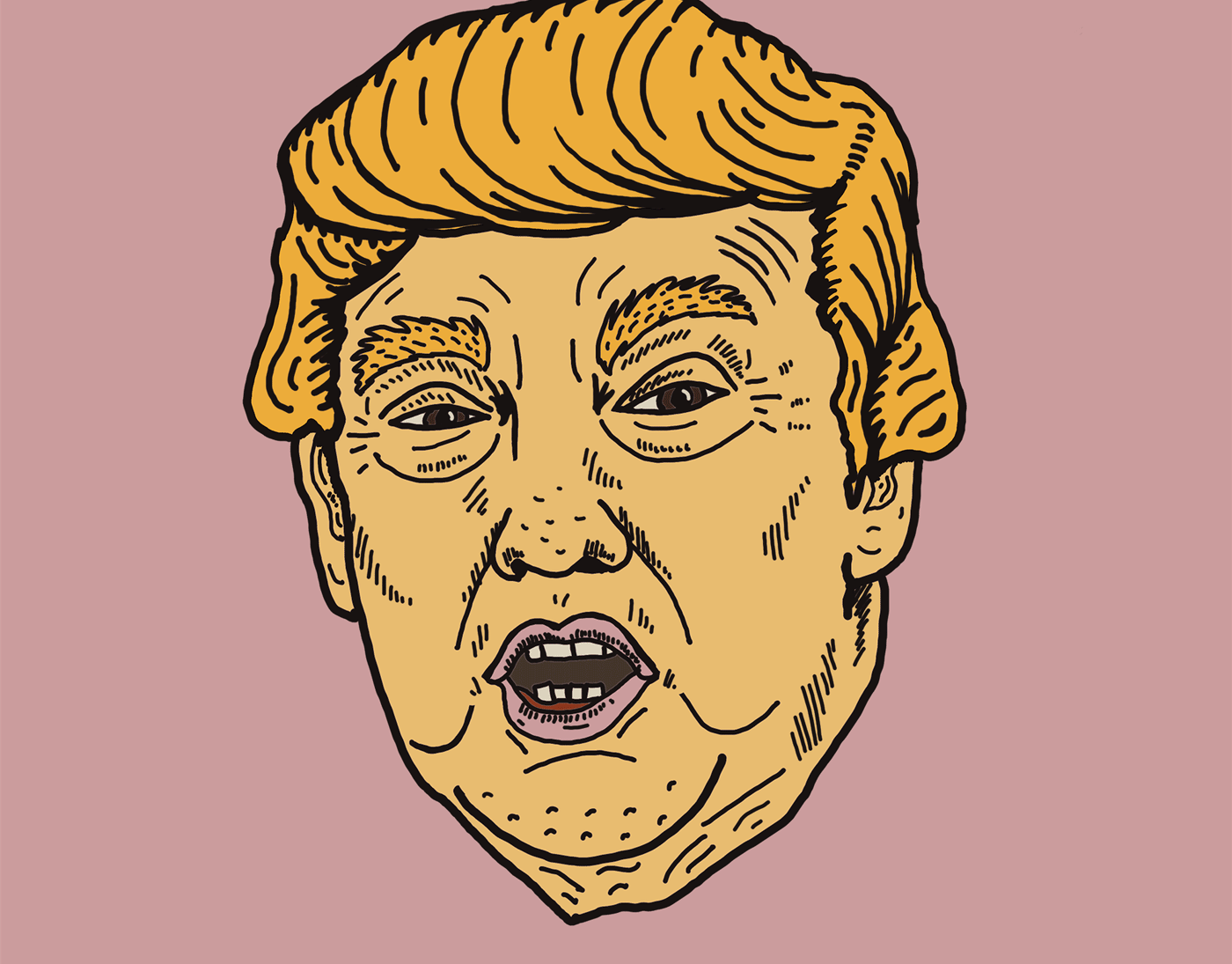
Trump Drool GIF
I saw a picture of Trump online and could only imagine him drooling with his ugly mouth slightly open looking stupid as usual. So, one thing lead to another and i made this GIF. Please enjoy.
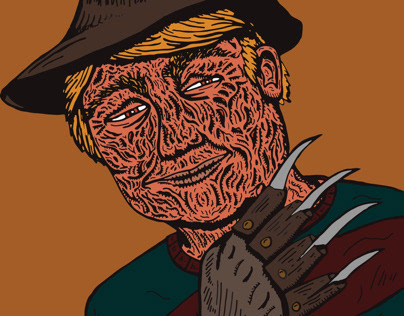
Donny Krueger
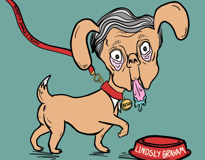
Good Boy Lindsey Graham
Mcconnell Monster
Mitch McConnell, our dear Senate Majority leader. This is how I see him, and monster. He uses money, power, and fear to control our senate and shows a complete lack of compassion or care for the average American.
Look Mom, No Hands
A World Divided
Father, Son, Unholy
Is This It?
Anxiety is a Prison
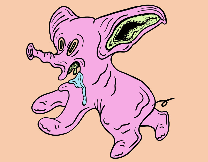
Pink Elephant
At Least I Have My Friends
Just a little drawing I did for fun on Adobe Fresco.
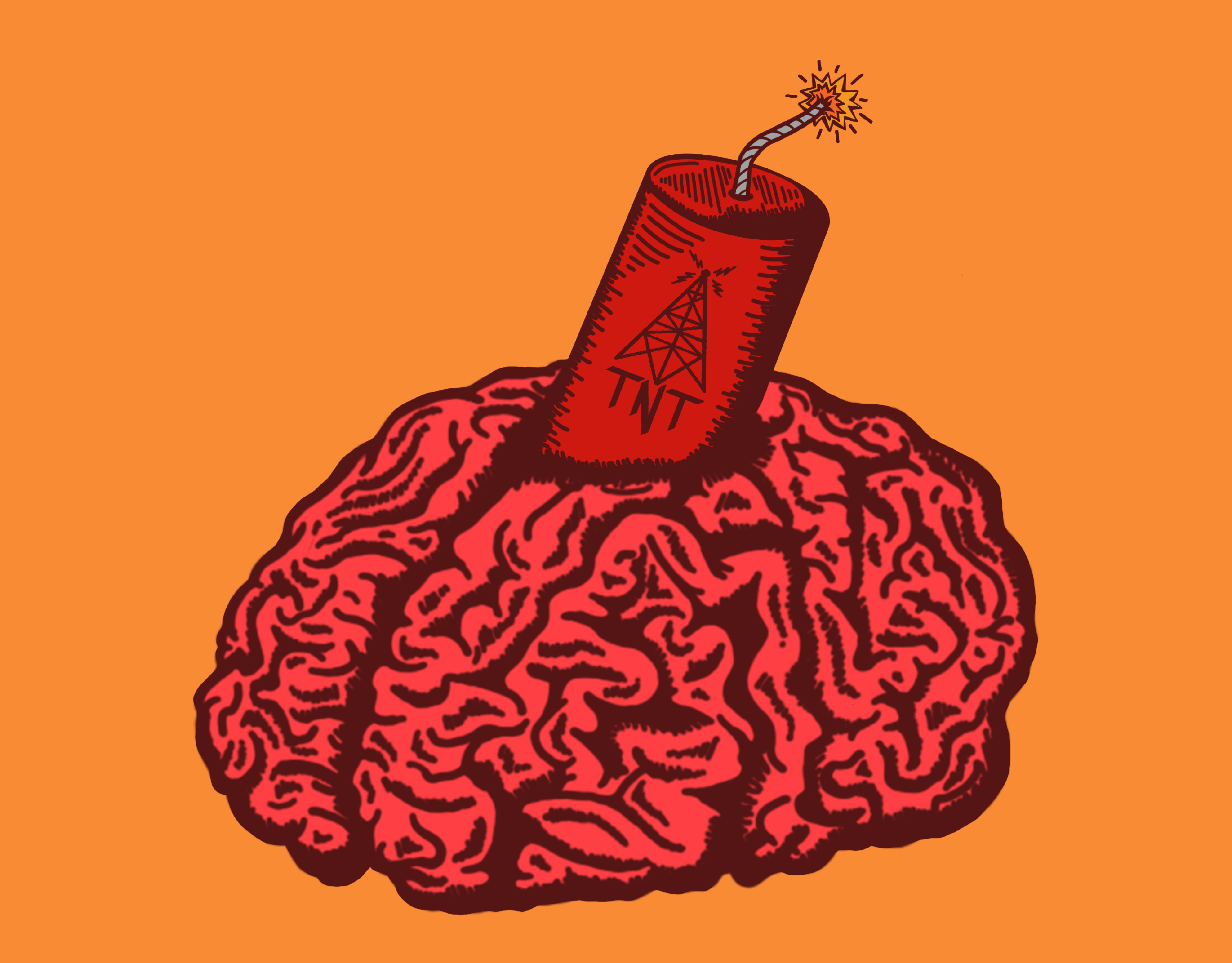
TNT: Trivia In The Tavern
Branding I did for TNT: Trivia In the Tavern hosted at Tower Tavern in Kansas City. They needed a branding to be used for their Facebook page snd website as well as printed media such as a poster, business cards, and stickers to be handed out. Since the Acronym was TNT I automatically thought about a stick of dynamite in a brain. A little play on having your brain exploding with knowledge as well.
Client Logo Design
Logo Design for client who is a performer and wanted something unique and musical. Art Deco inspired
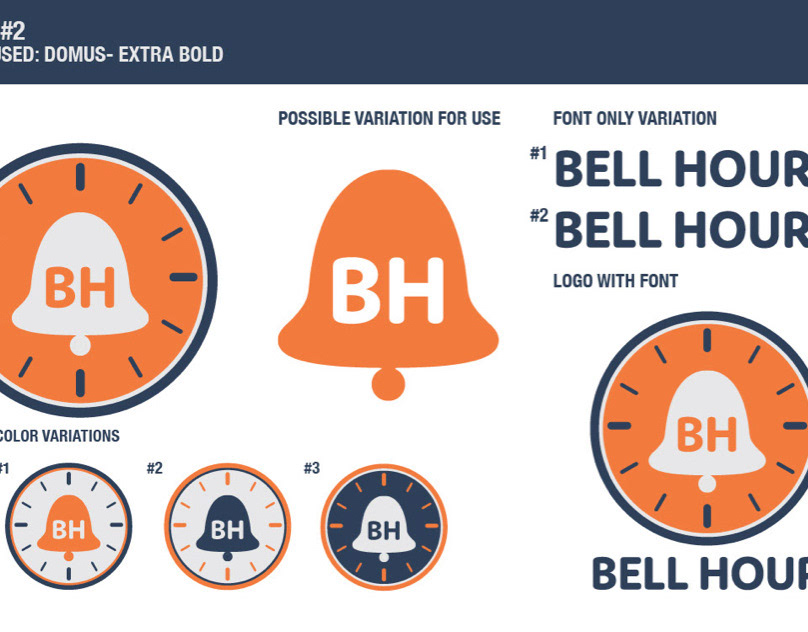
Bell Hour Logo Design
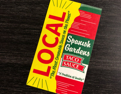
Spanish Gardens Shelf Talker
Shelf talker design for Spanish Gardens Taco Sauce in Kansas City Missouri.
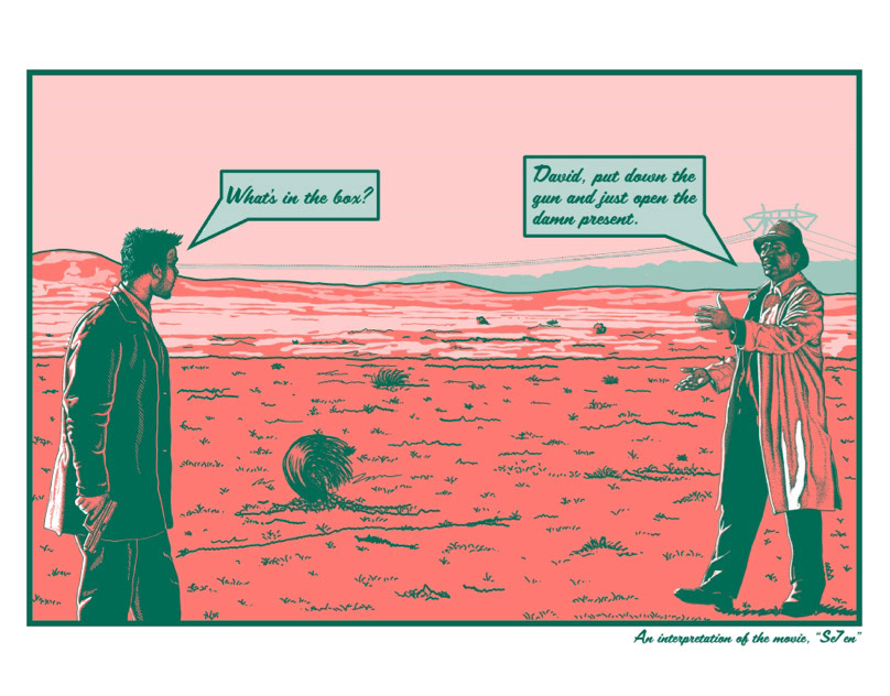
Se7en Inspired Holiday Card
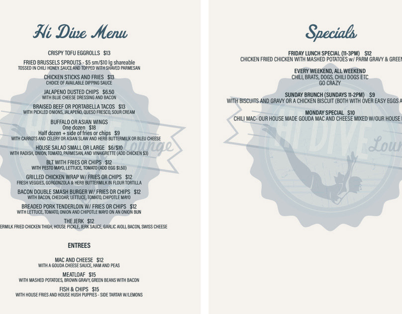
Hi Dive Menu
Tower Tavern Hours Change
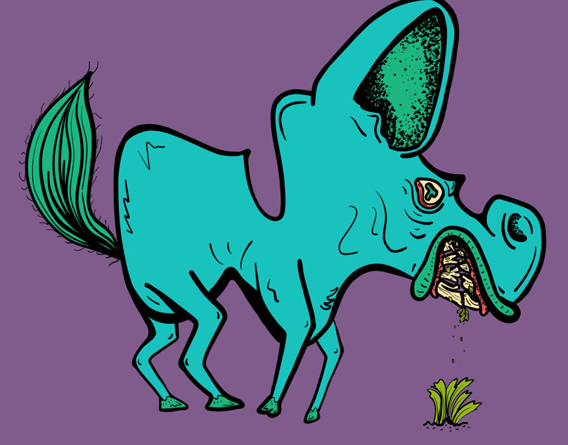
Donkey
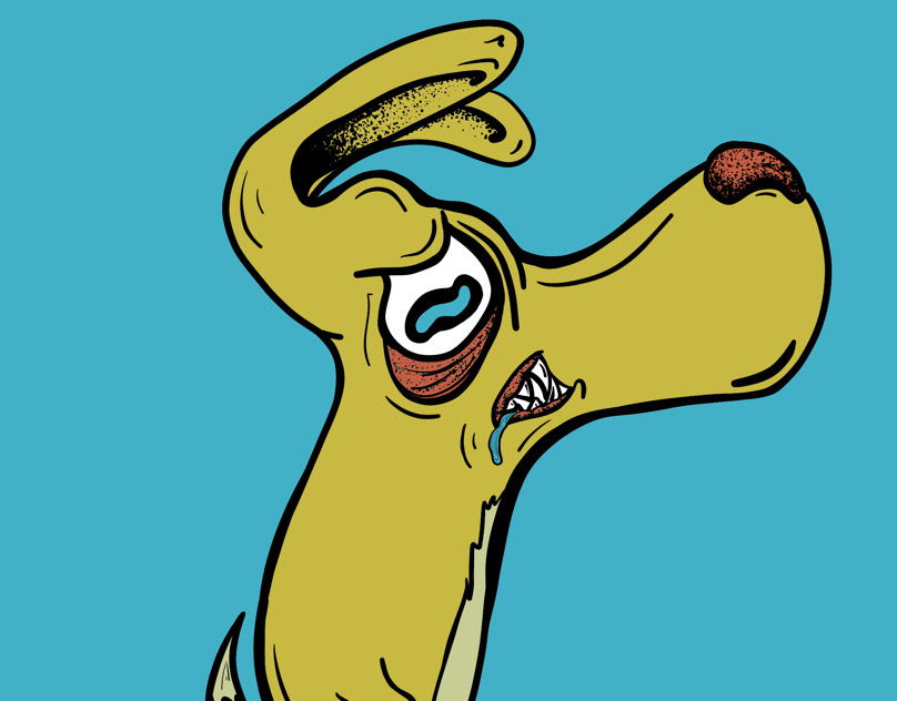
Nervous dog
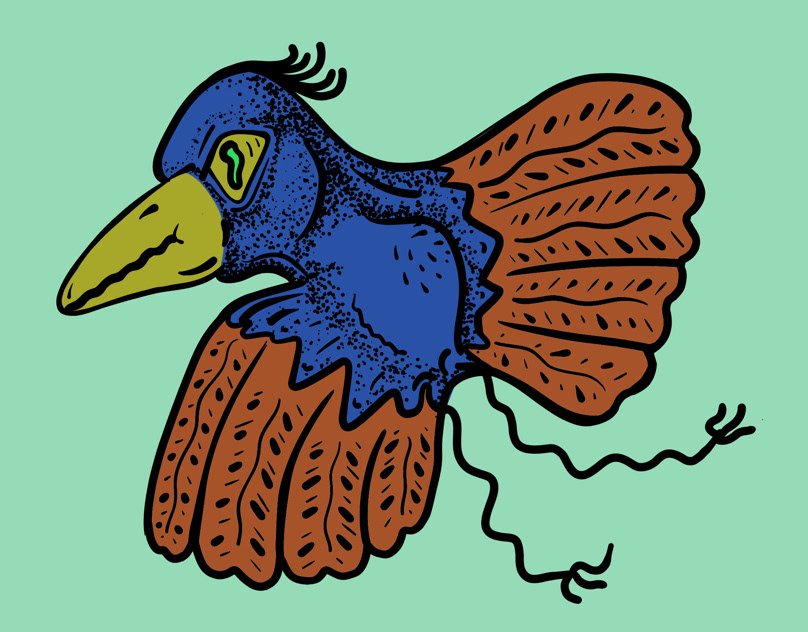
Bird
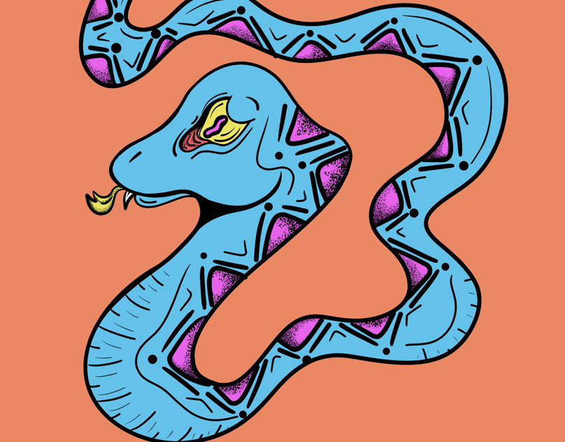
Snake
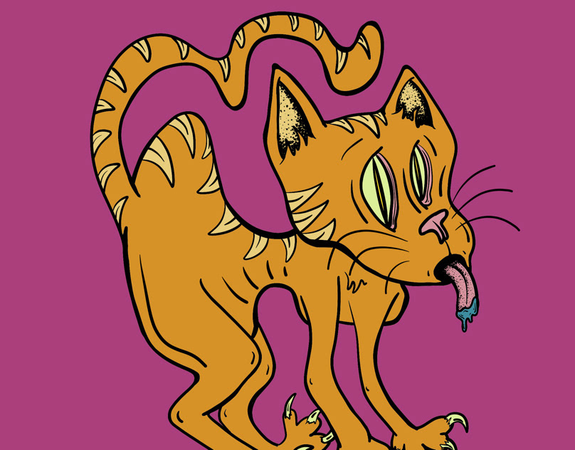
Cat Got Your Tongue
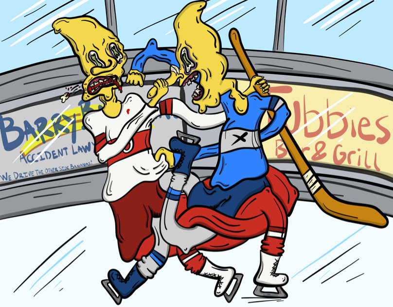
Frickin Weirdo Hockey Fight
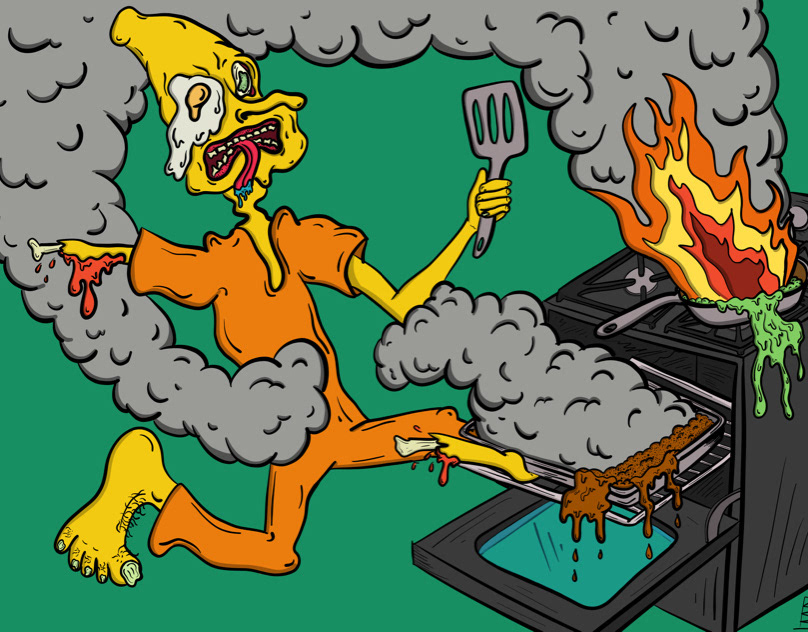
Cooking is Fun
Tower Social Post
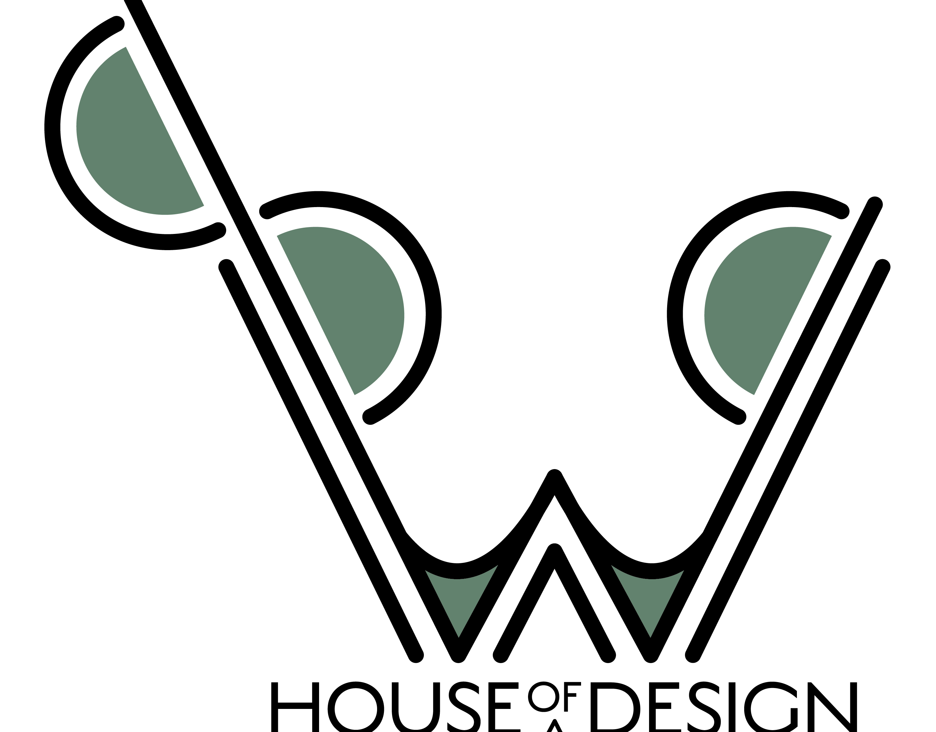
Logo Design for W89 House of Design
Logo Design for W89 House of Design in Kansas City. Focused on mid century furniture and unique art, the clients wanted a logo that would mimic a mid-century look with some modern details.
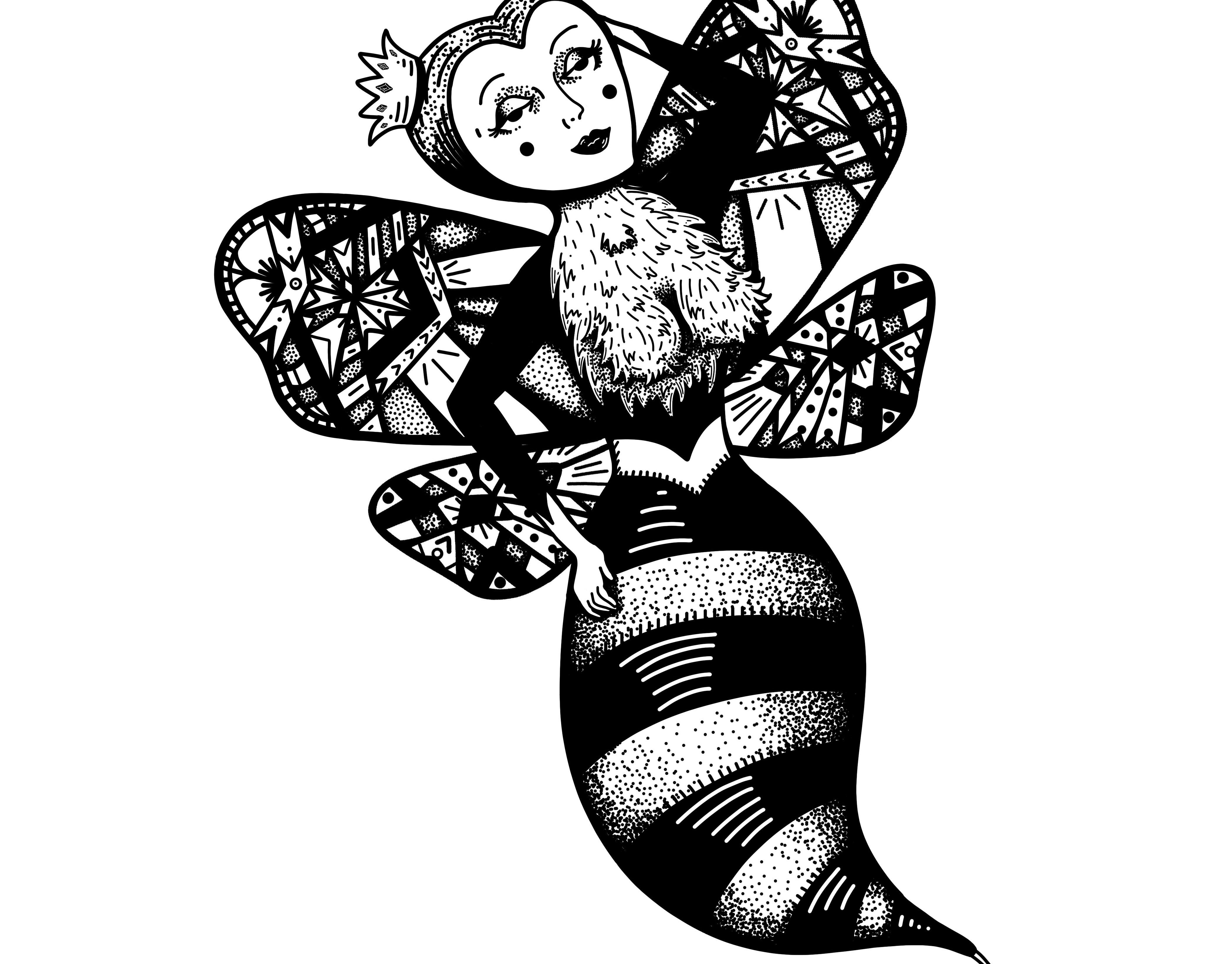
Queen Bee Tattoo Design
Tattoo design for client that wanted a sexy queen bee.
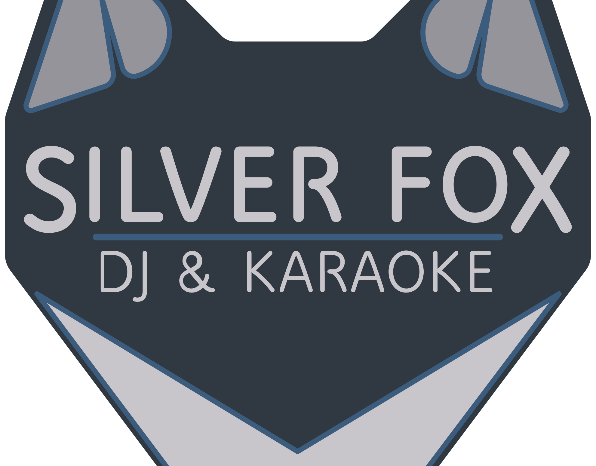
Silver Fox DJ & Karaoke Logo Design
Logo Design for Silver Fox DJ & Karaoke
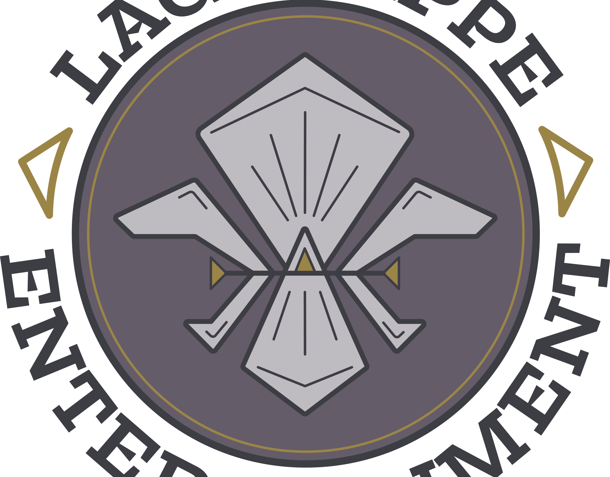
Lagniappe Entertainment Logo Design
Logo Design for Lagniappe Entertainment. Client I originally for New Orleans and already had a fleurdelise type logo. I updated the fleurdelise style, font, then softened the purple and yellow colors to make them more modern and appealing.
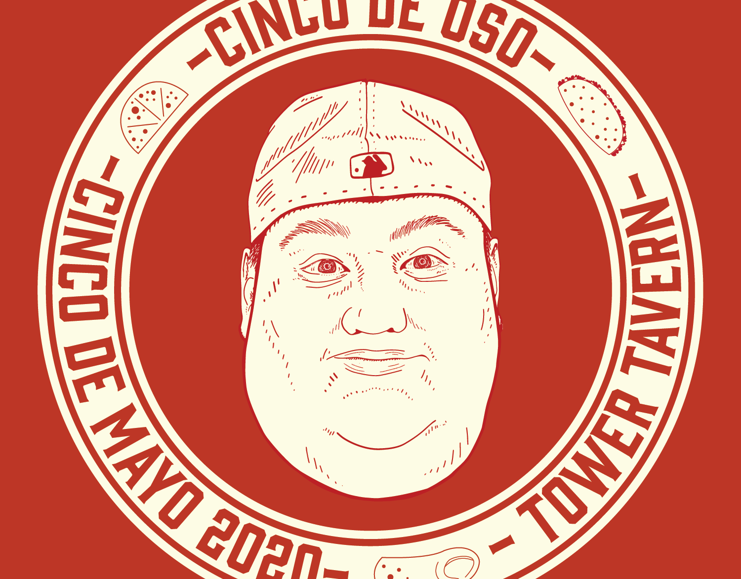
Cinco De Mayo Advertisement and Menu for Tower Tavern
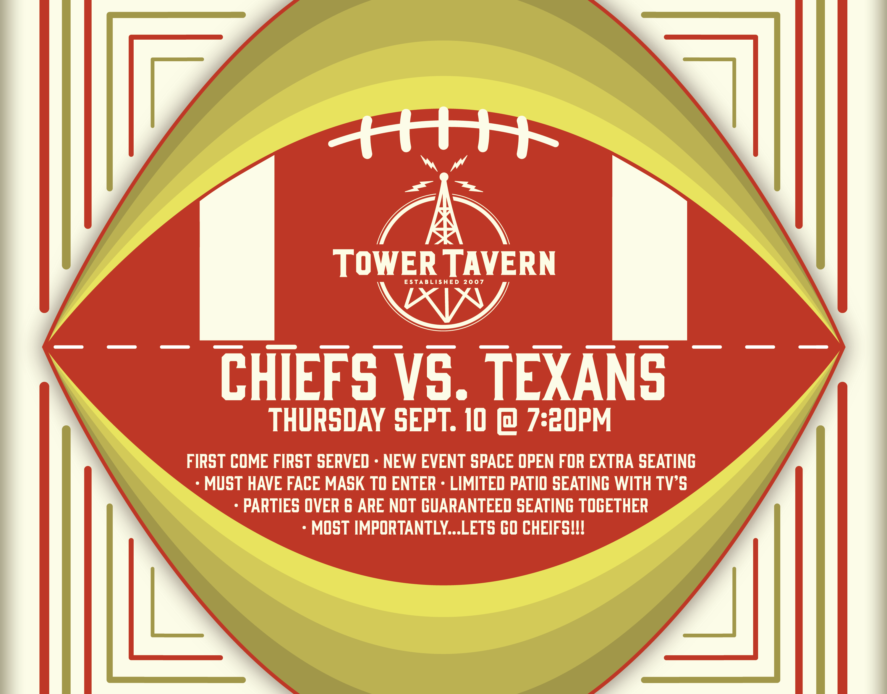
Sports Event Advertisements for Tower Tavern
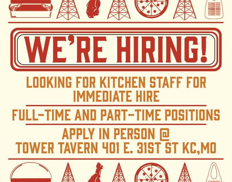
Food Promotions & Signage for Tower Tavern
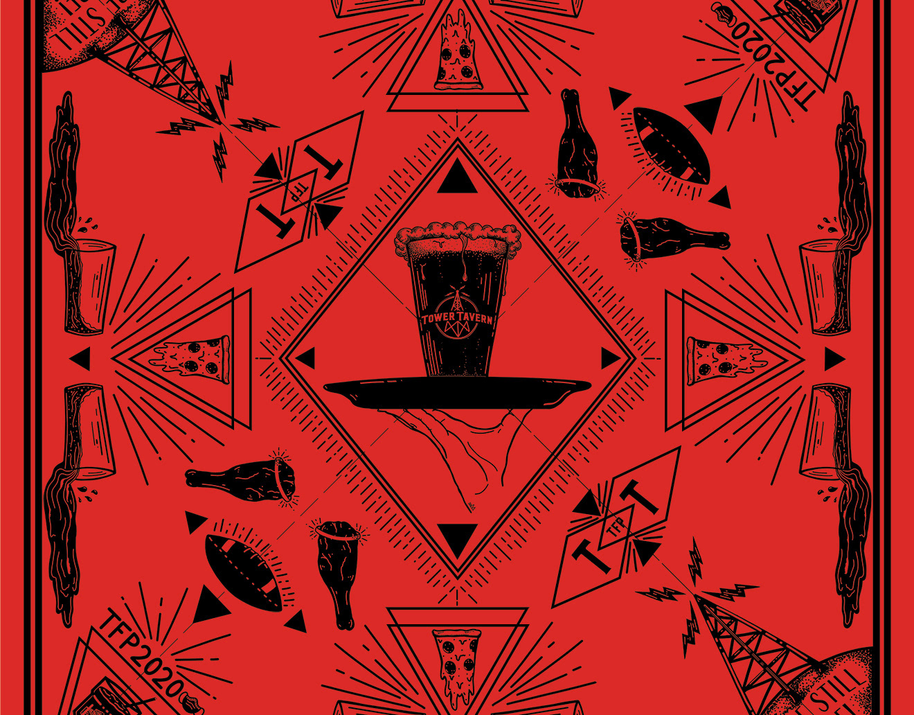
Bandana Design for Tower Tavern
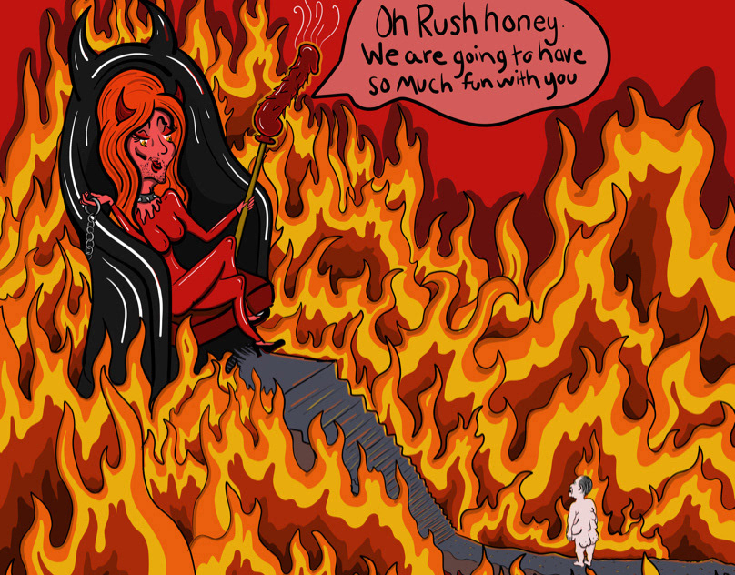
Rush’s Personal Hell
To all my Queens, Kings, non-binary royalty, and just any people who this man has targeted or made furious. May this ease your mind a bit and maybe make you smile.
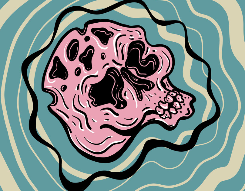
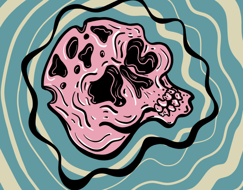
Holy Head
Groovy
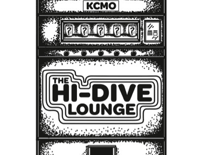
Promo drawing for The Hi-Dive Lounge
A little promo drawing I did of The Hi-Dive Lounge’s mystery beer machine.
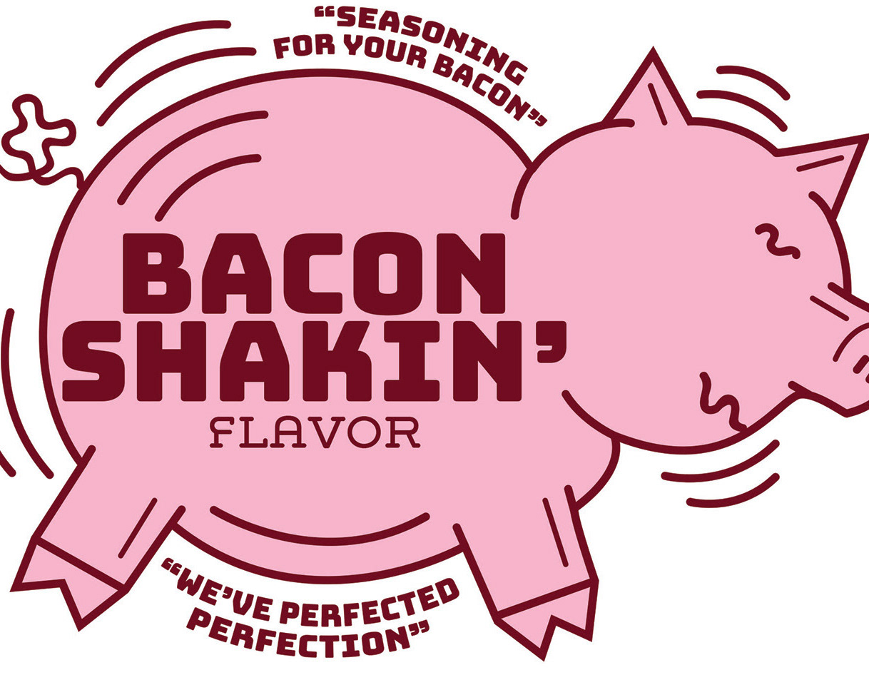
Bacon Shakin'
Label design for bacon seasoning
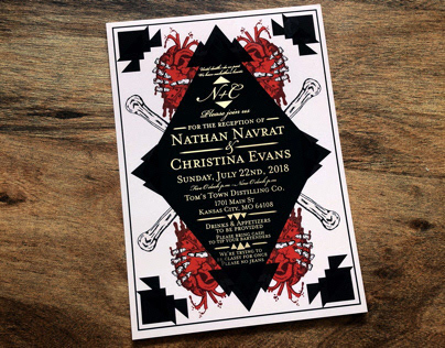
Wedding Reception Invitations
Wedding reception invitation design I designed for our own wedding reception. I like to find the humor and beauty in the morbid. I was inspired by the, “until death do us part,” vow. Gold foil lettering.

Tower Tavern Beer Menu
Beer menu design for Tower Tavern in Kc.
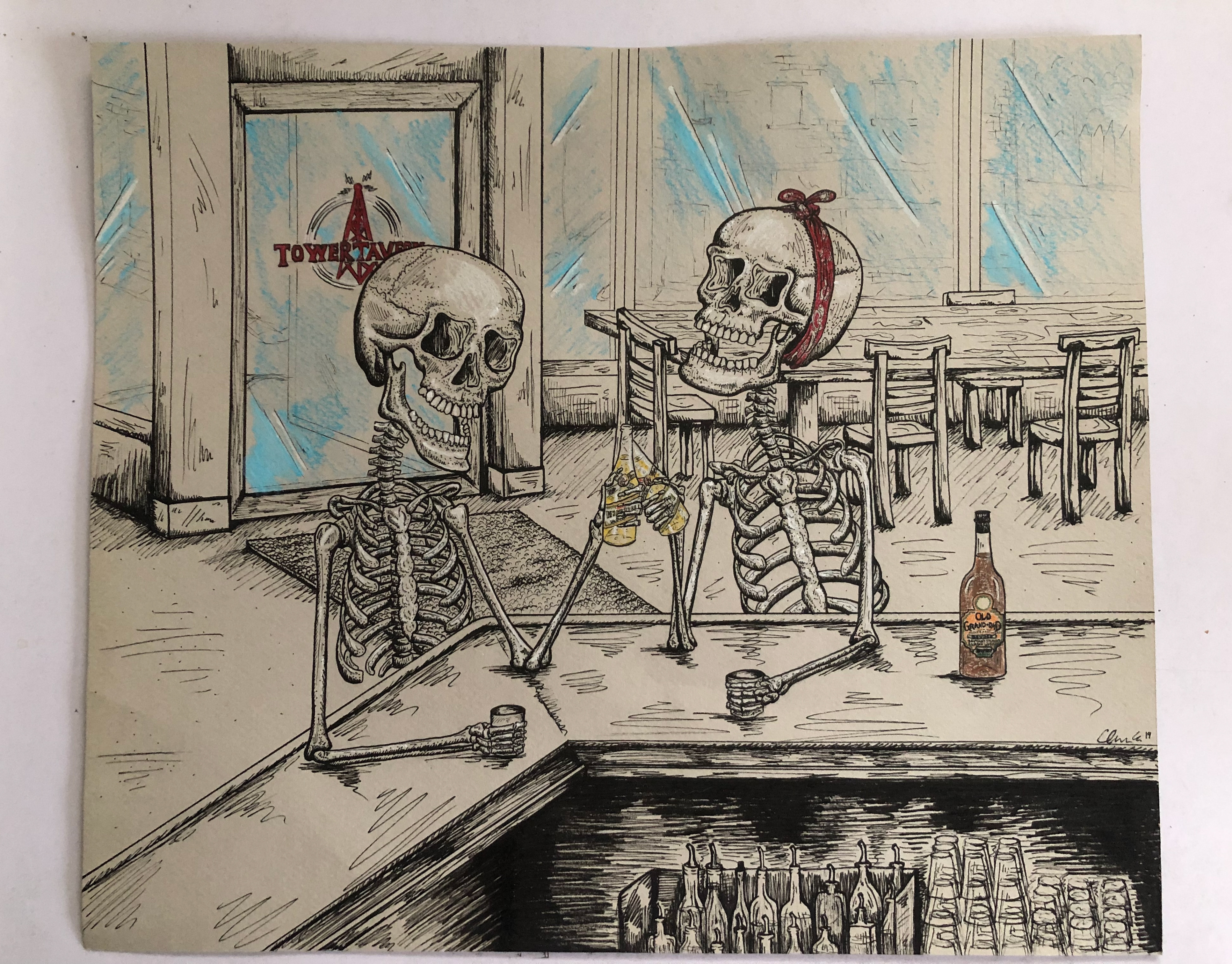
Cheers To Us
A commissioned drawing I did of friends of mine as skeletons.
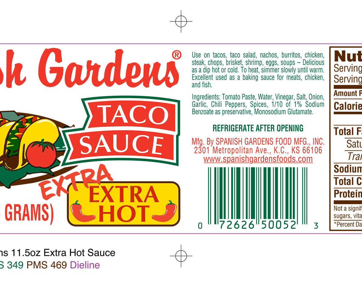
Spanish Gardens Extra Extra Hot
"Extra Extra Hot" label design update for Spanish Gardens Taco Sauce.
Spanish Gardens Cardboard Shelf.
Cardboard shelf design for Spanish Gardens taco sauce. This shelf would be used in grocery stores and markets. I designed the artwork to the specifications of a cardboard shelf supplied by the manufacturer.
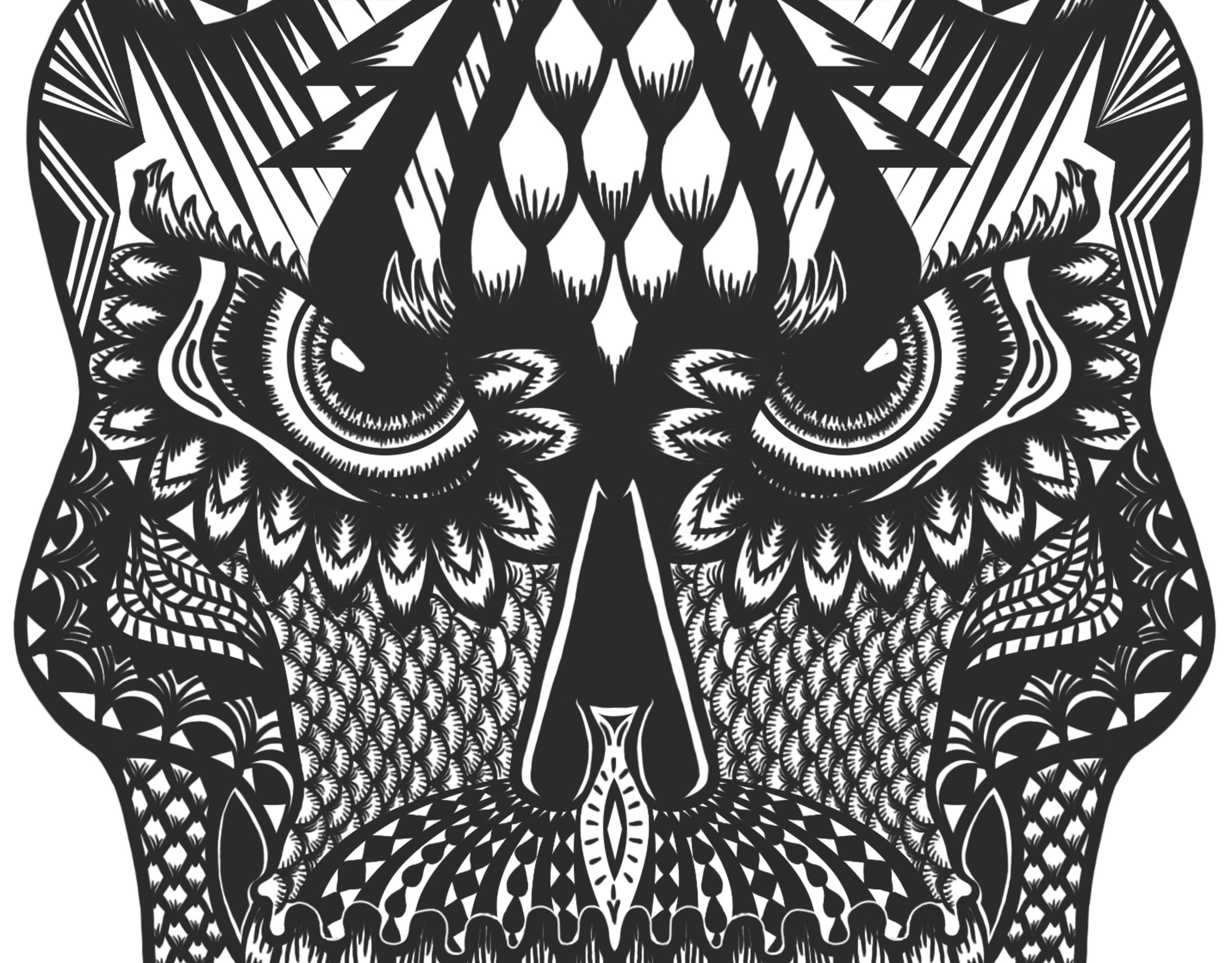
Skull Tattoo
Another tattoo design I did for the same client I drew the other skull for. Ultimately went with the other design but I thought I would post this one too.
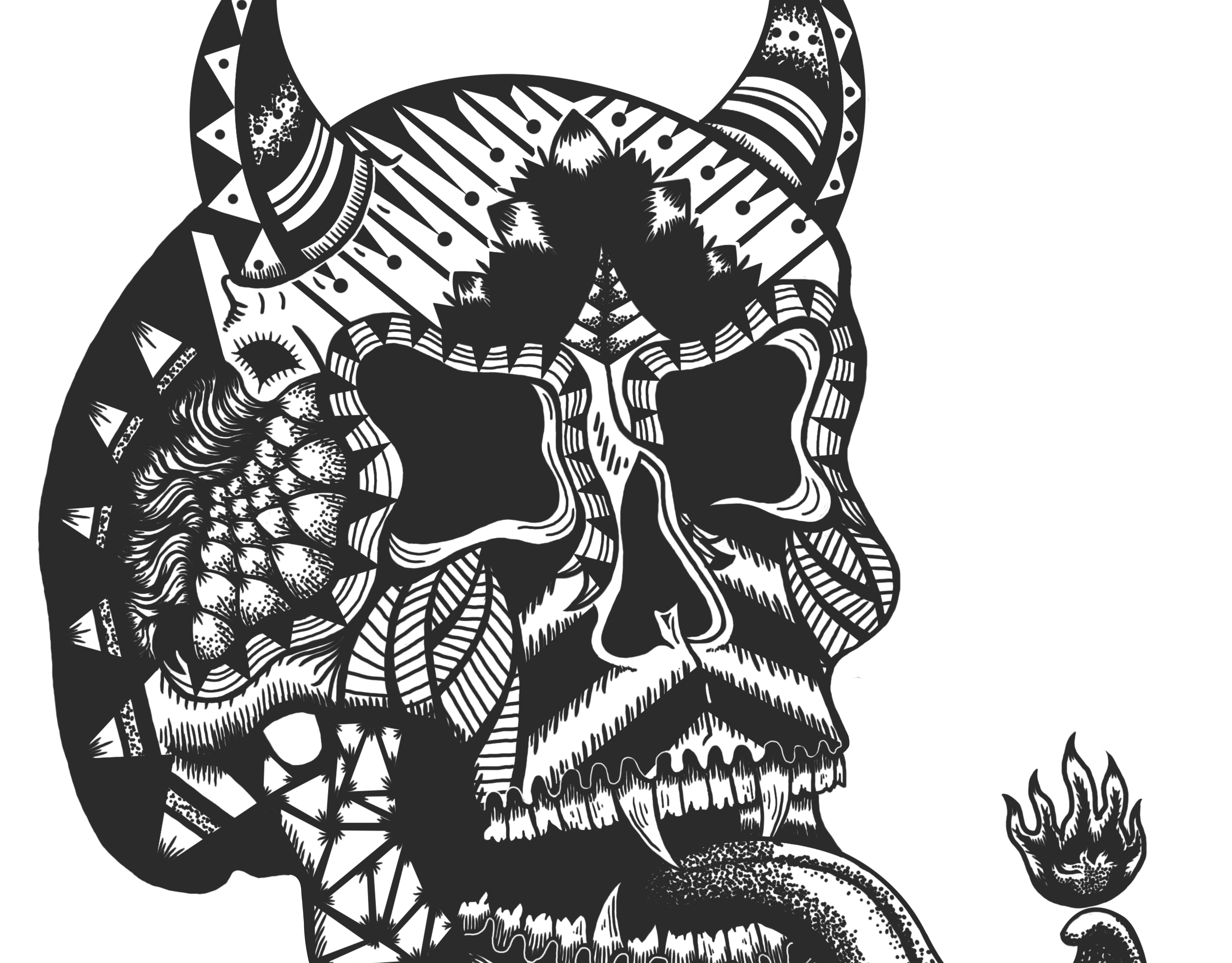
Skull Tattoo Design
Tattoo design I did for a freelance client of mine. Wanted a demonic type face with designs all of his face. Chose more of a skull type demon. Decided he wanted more of a smirk so I distorted the face a bit to get a nice smile.
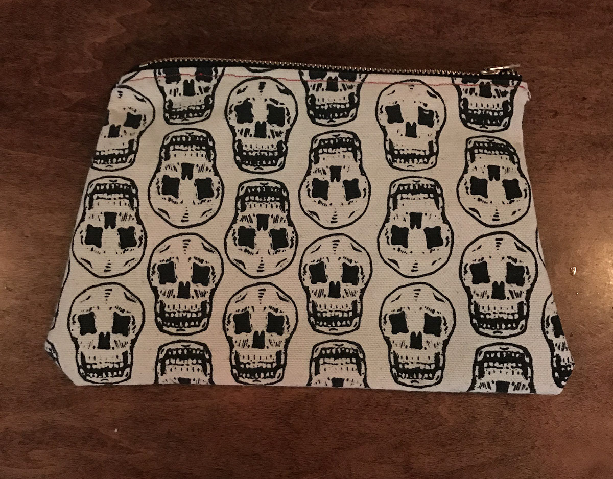
Skull bag
Skull pattern bag design
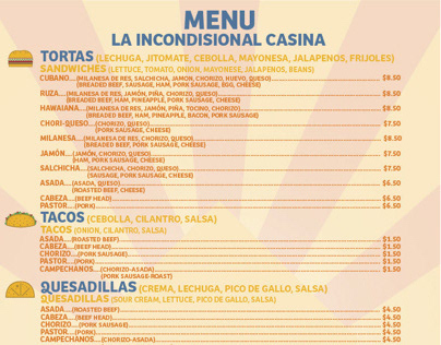
Menu Design
Menu Design for a friends food truck. English is his second language so I helped translate the menu to English.

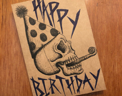
Christmas Card Design
Funny Christmas card I designed.
Various Birthday Cards
Various birthday cards I have drawn for people.
Tower Tavern t-shirt
T-shirt Iron maiden

Pineapple

Brain Pillow
I printed a drawing I did of a detatched brain onto canvas and sewed it into a pillow.
Get it Out

Spinning Thoughts
Veggies
Vegetable drawings
Leech
Leech drawing

Three Amigos Afloat
Logo design I did for some friends for their canoeing adventure.
Let It Out
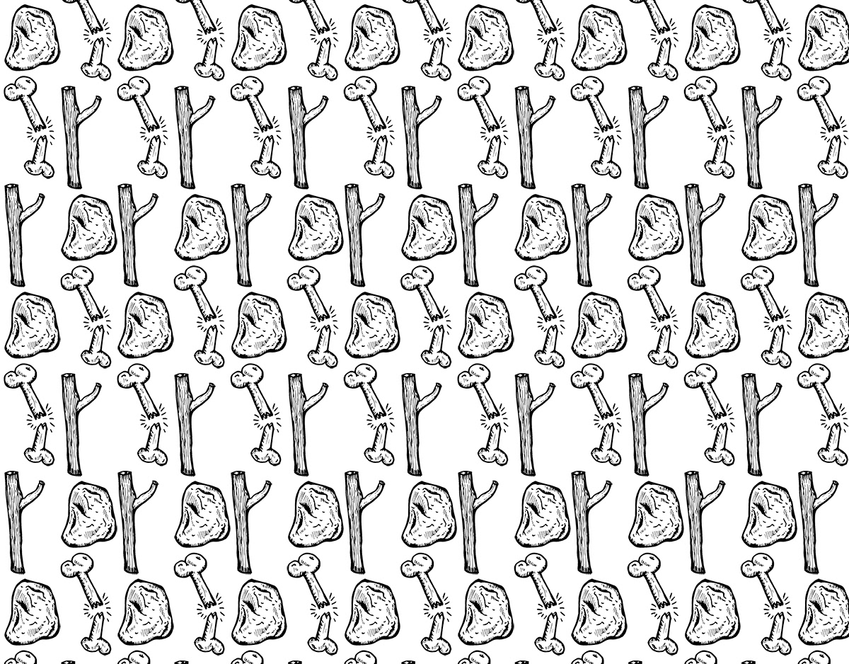
Sticks and Stones
Sticks and stones pattern design and ink drawing
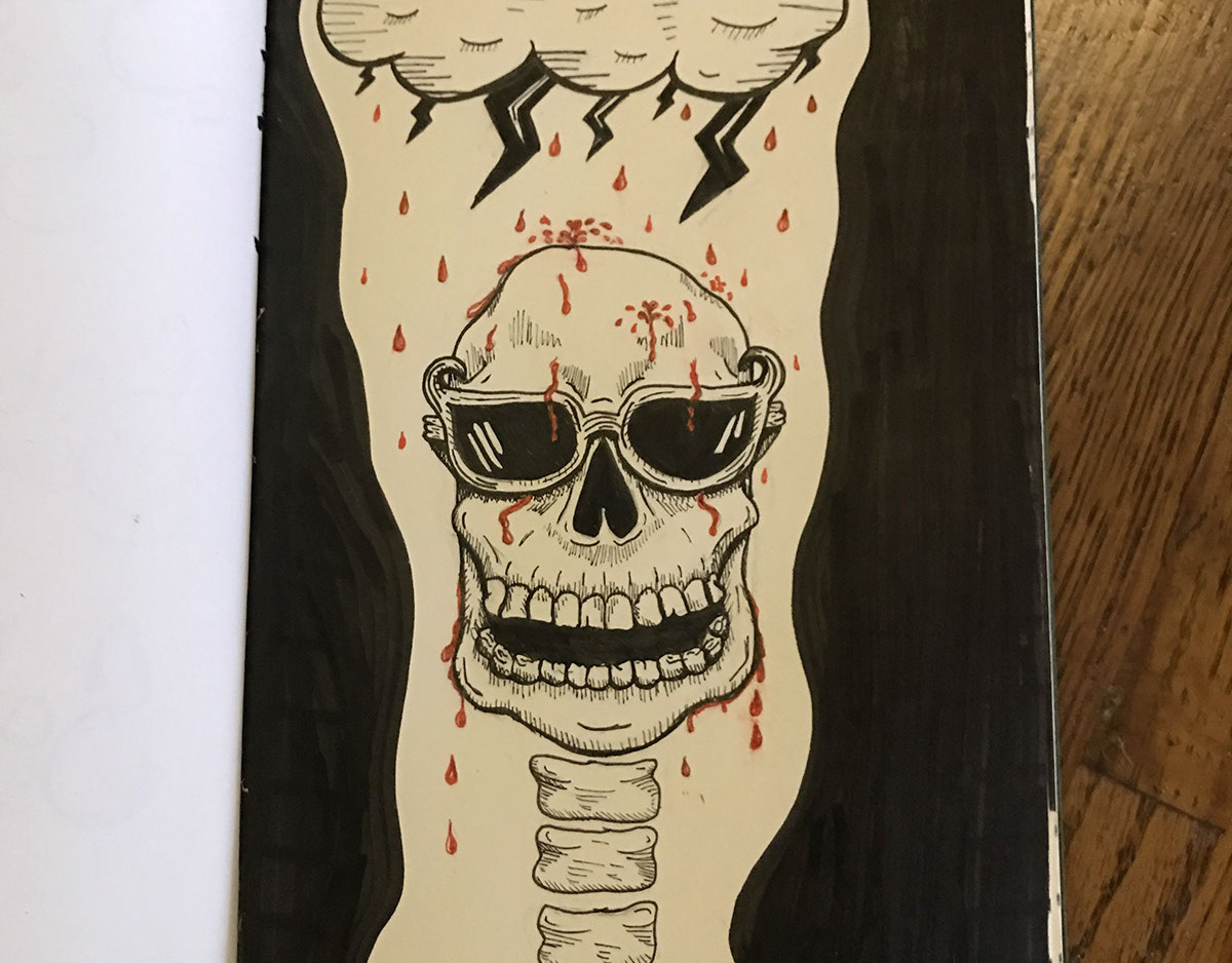
A Beautiful Day
Bloody rainy day ink drawing

Dying to be a Cat
Cat skull drawing
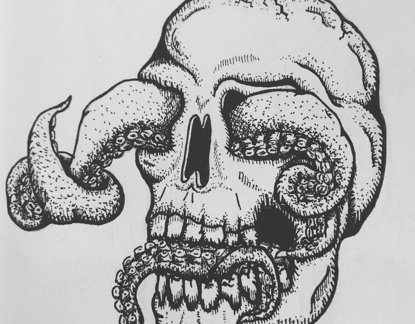
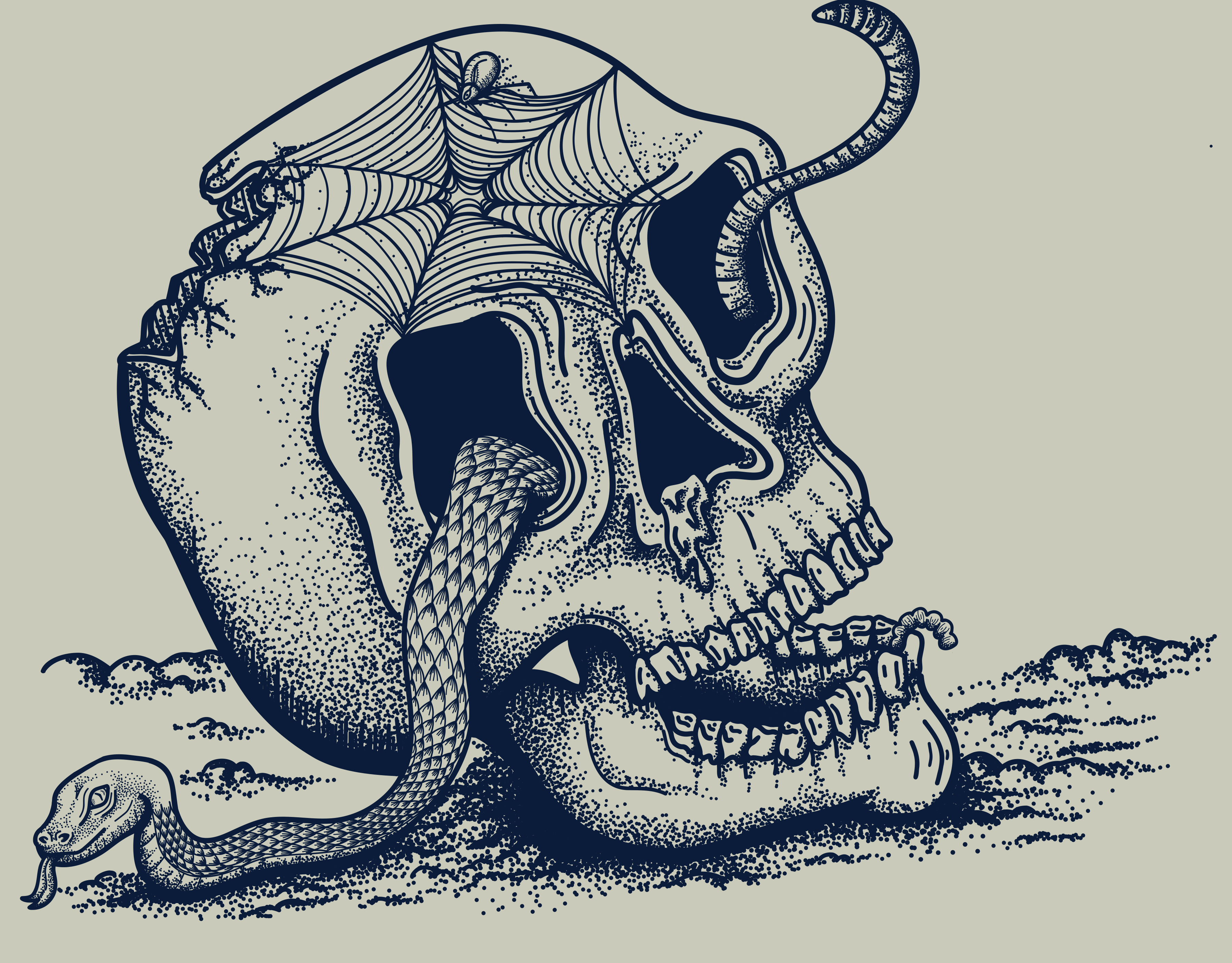
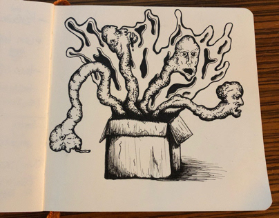
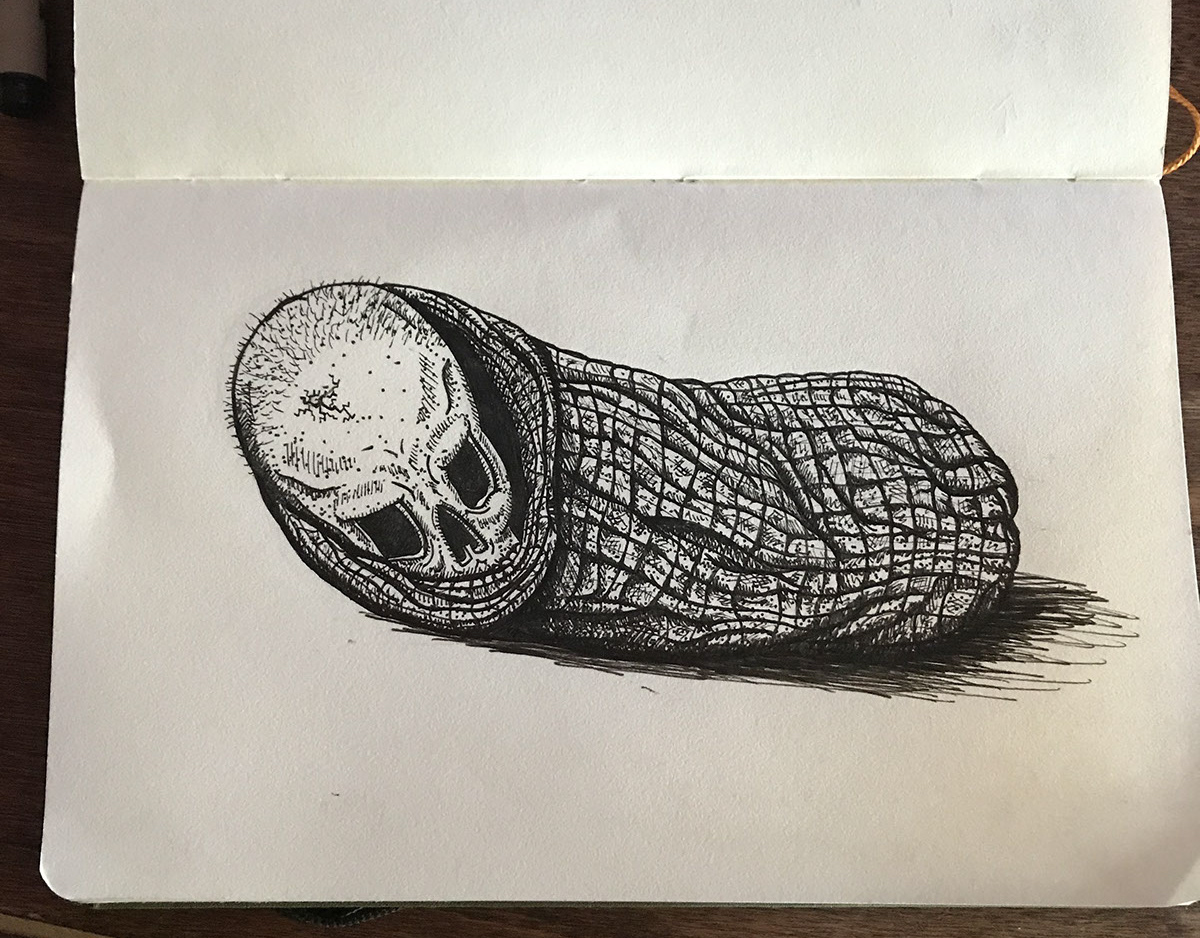
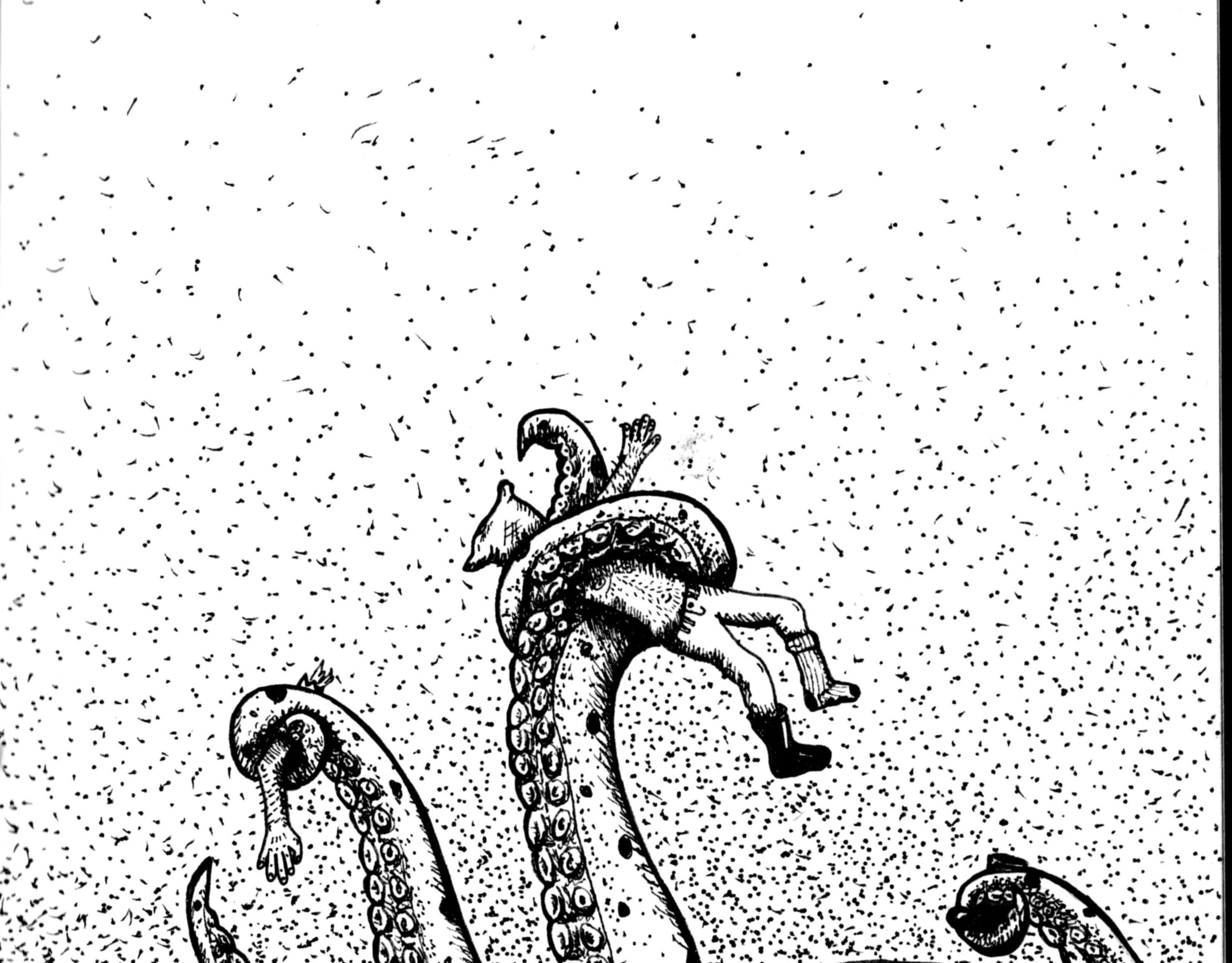
Octo-skull
Octopus skull ink drawing
Motorcycle jacket patch
Motorcycle jacket patch design

Birthdays are Dead
Ink pen drawing

Full Moon Christmas Card
Printed Christmas card with envelope.
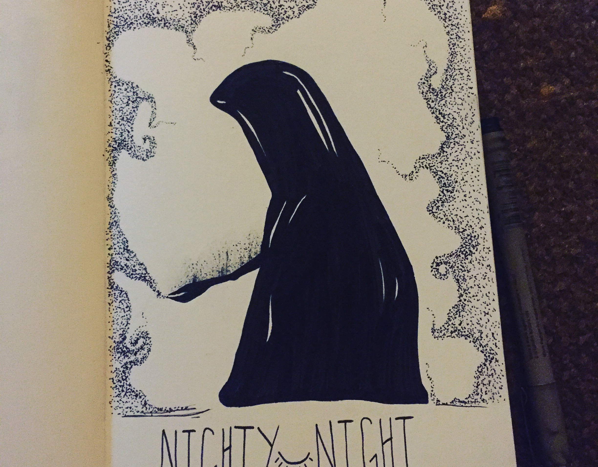
Nighty Night
Spooky pen drawing
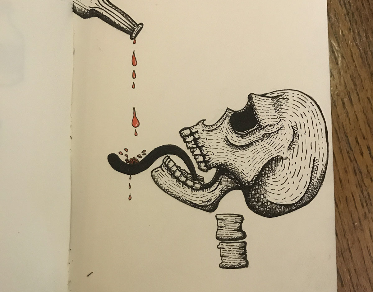
Drink Up
Ink pen drawing
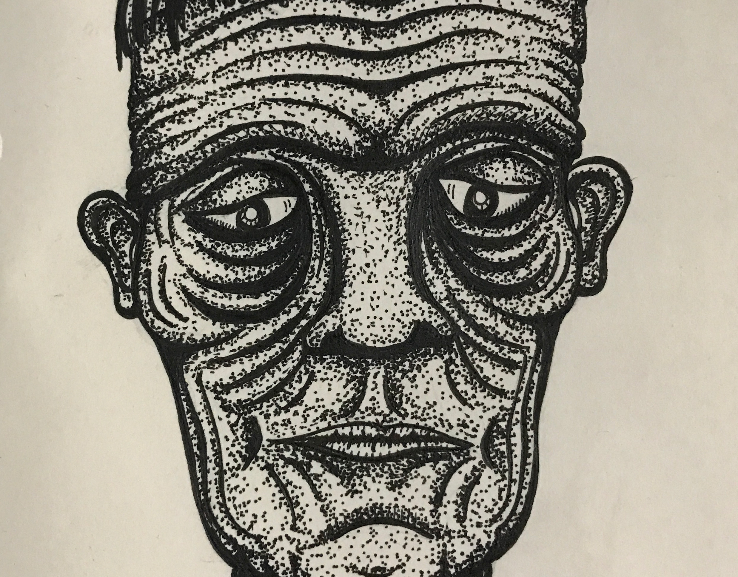
Frankenstein Monster
Sad Frankenstein Monster
Mummy
Mummy ink pen drawing
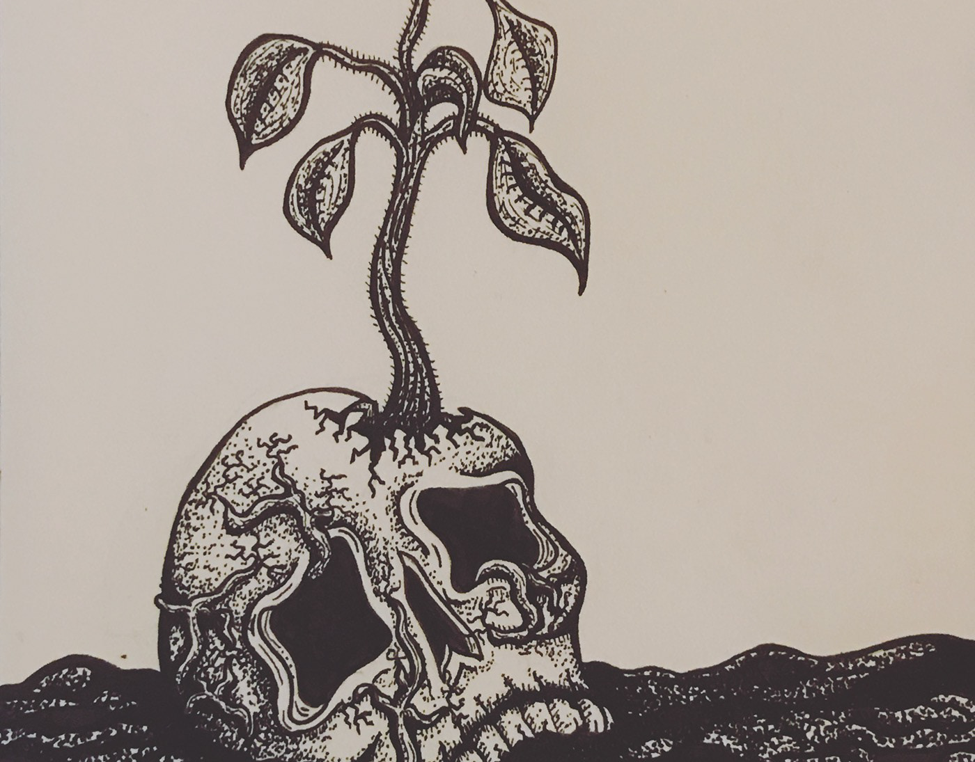
Dying to Grow
Ink drawing
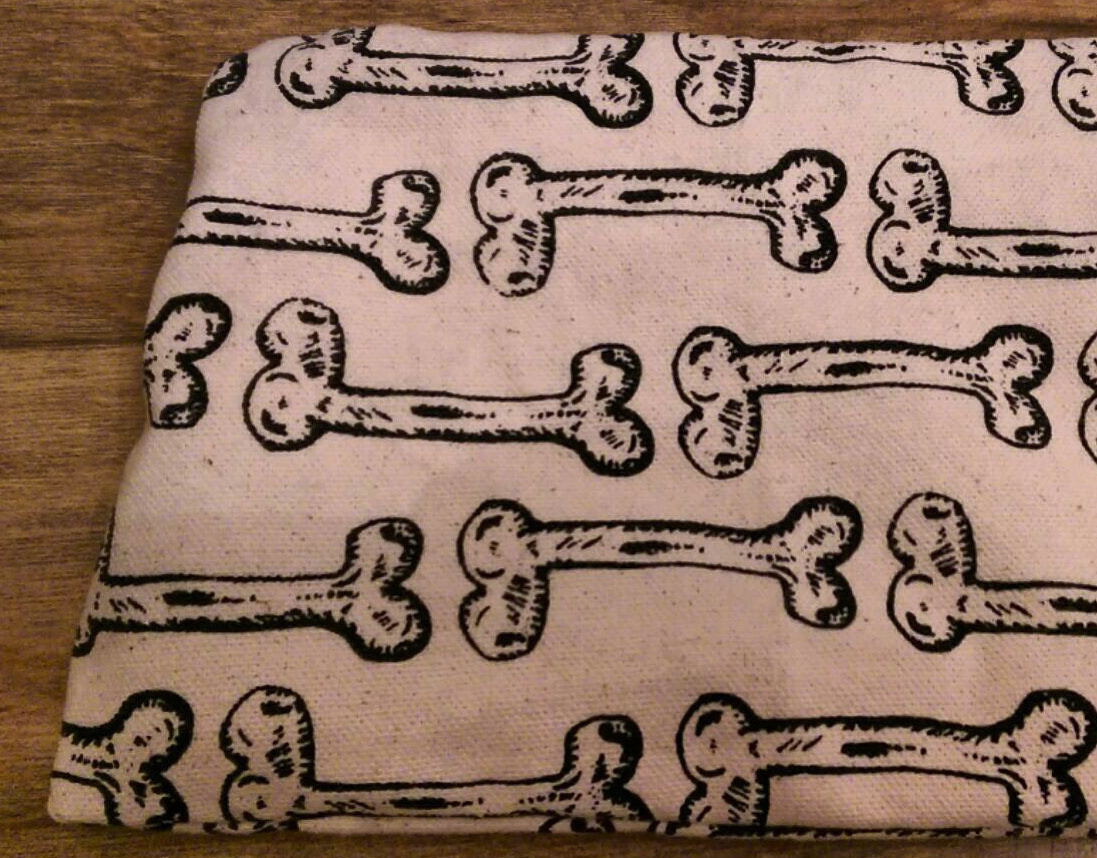
Bones bag
Bones bag pattern design

Wristlet design
Wristlet pattern design

lemon mouth
Sticker/merch design
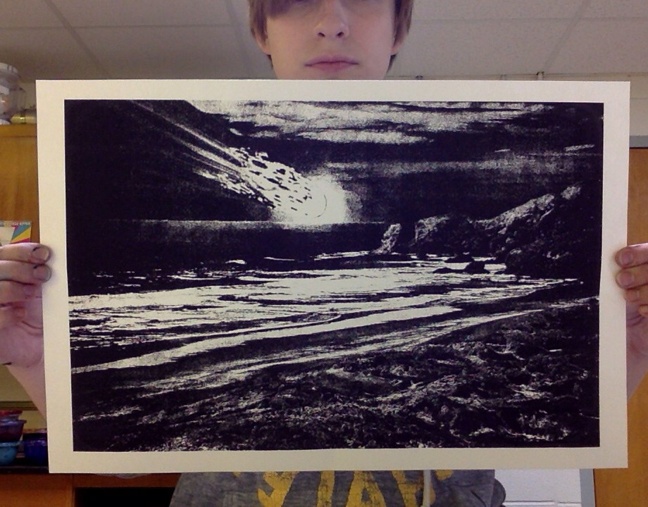
Test for doom print
Test printing
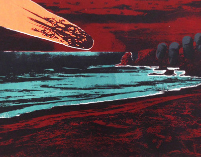
Watching It All End
Looking at Illusionist Surrealism work I was captivated by Max Ernst and his destructed post-apocalyptic dreamscape paintings he made using “decalcomania” technique. I was interested in the reoccurring theme of destruction, devastation, and human ignorance seen in surrealism, along with the use of symbolic imagery. I processed and researched how I would go about making my artwork. I came up with the idea of the Asteroid and how it is seen as a conduit of destruction, but an asteroid is also given credit for the rise of the mammals and eventual evolution of Humans. I wanted to create a scene of an Asteroid about to make impact with the planet. I decided to make the scene of the Asteroid coming in over the ocean because the Ocean is a place that man does not inhabit, cannot survive in, and is still largely unexplored. Humans need water to survive and it is what gave us life. But, the salt water that covers most of our planet is undrinkable because it would dehydrate our bodies and eventually kill us. So, something that is symbolic of life can also bring us death. I wanted it to feel like there was nothing that could be done because the ocean cuts you off. This is where the sand comes in. I used a picture of the sand and water and put it into Photoshop where I manipulated elements of it. I decided to keep with Surrealist practice and put myself into a calm, undistracted state. I stared at the image and drew what I saw. I could see faces in the sand so I used various tools to draw and exaggerate what I saw. The faces are stuck still in the sand; they can’t go into the ocean because they will be washed away. So, they are helpless to wait for their impending doom. I did the same thing with the eyes in the clouds. I stared and drew the eyes where I saw them. The sky surrounds our planet and is constantly watching us. The eyes are looking all around expressing concern, fear, and dissatisfaction with what is supposed to be our fault. There is of eye that is bigger and darker than the other eyes. That one is looking at the hand placed on the rock. The hand has a firm grip on the rock but is not safe from the asteroid and is holding on out of desperation. The colors of the bloody red, and dark green, and the bright radiant orange give the piece a sense of fear and destruction. I wanted it to feel very wrong. Since the Print did not turn out as detailed as hoped I included the digital version.
Dragging on
Pen drawing
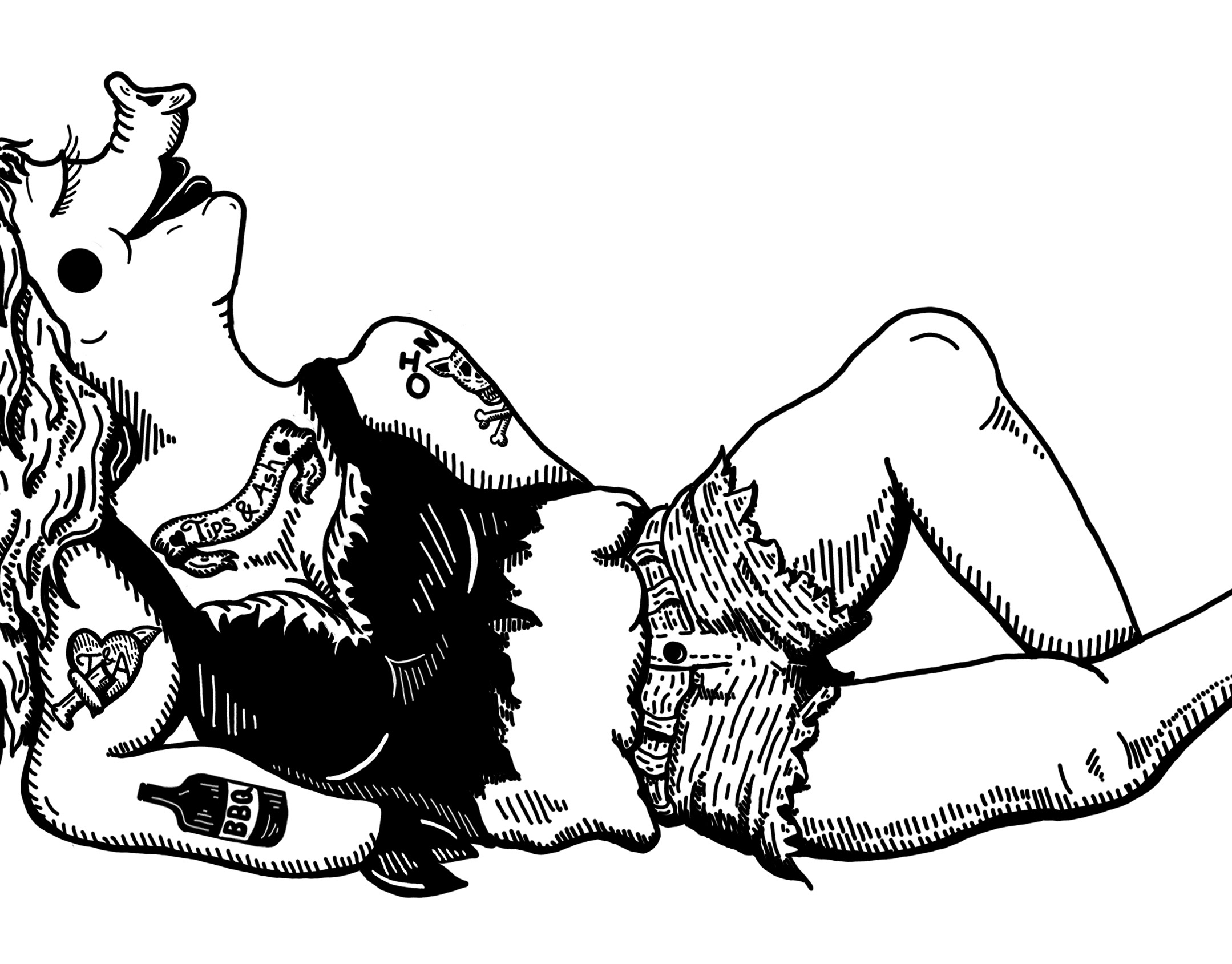
Tips and Ash
Bbq competition team branding
Get Your Sea Legs
Illustration for my "Dead Under Water" series.
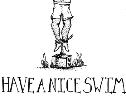
Have a Nice Swim
Illustration for my "Dead Under Water" series.
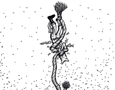
Don't Hold Me Down
Little illustration I did for my "Dead Under Water" series

Jerk Off Wipes
Jerk Off wipes are theoretical wipes a female could use to fend off jerks from bothering her when she out and about
Aggrieved Poster Set
A set of three posters I designed around the word, "Aggrieved". Aggrieved means,feeling resentment at being unfairly treated. These celebrities felt they were being unfairly treated and misjudged for what they did.
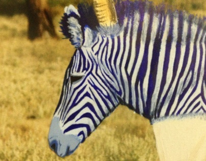
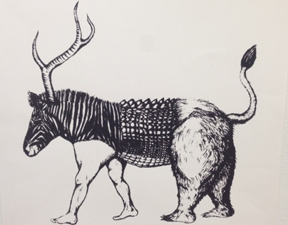
Beast Painting
I found this picture of a zebra in the wild with the frame at a thrift store for $3. I decided to paint over the zebra with other animals to make this beastly creation.
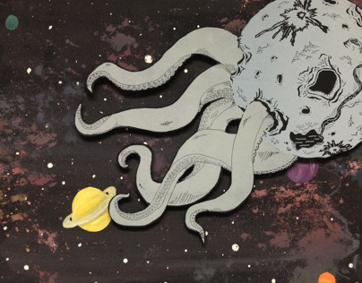
The End is Near
I am always looking for ways to involve space and the ocean in my designs. Here you have the best of both worlds. Why can't a planet have tentacles and wreak havoc on the other planets? For this project I printed the planet and tentacles on a piece of board and cut it out, then I printed the space on a piece of paper and cut out where I wanted the planets, painted the planets and glued them in under the paper where the holes where. After that I mounted the spaces scene on board and mounted the "octo-planet" probably about 1/2 inches above the paper.

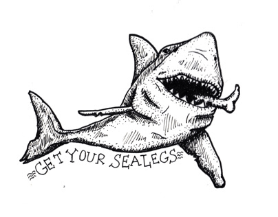
Intaglio Shark
2 color intaglio print
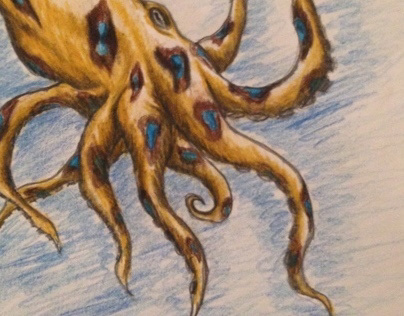
Octo-sketch
Just a sketch for fun of a Blue-ringed Octopus
Bhojan Branding
My contribution to a team project. We were given a restaurant floorspace and tasked with branding and designing the interior for a resturaunt we made up.
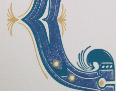
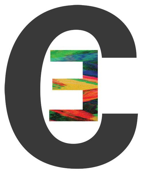
Drop Cap "C"
Drop cap "C" I designed and printed.

Losing My Mind
Screen print I drew and designed using photoshop. At the time I did this there were a lot of events in my life that sometimes made it difficult to deal with everything. This was my way of expressing how I felt.
Skull Dude
Just a drawing to help fill up my sketchbook.
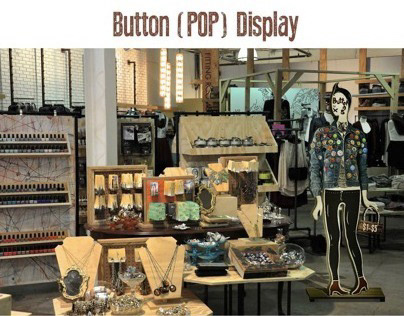
Button Point of Purchase Display
A point of purchase display I designed for buttons. Buttons often get poured into jars or displayed with jewelry with no originality going into the display. Buttons are a way expression and can be a conversation starter when you have loads of them plastered on a jacket or bag, I remember I had a jacket full of them in high school. I was inspired by decorated punk jackets and the rebellious nature of individual expression.

Sexy Leg Print
Print I did for Fun of a sexy, hairy leg.
Beast Print
A print of a drawing I did for a painting.

12 Floor Building Revit Model
This is a 12 story building I designed and rendered in Revit for an Architecture class. We were required to design a floor plan for the first floor and a floor of out choosing. The building has 4 full window wall protruding alcoves that can be used for private and meeting places. They open the space up and make the habitants feel like they are outside.

Cowboy Dan
This was a Linocut I did inspired by the Modest Mouse song, "Cowboy Dan."
Missouri's Finest
This is an intaglio I did of a stereotypical redneck in the great state of Missouri.

Invisible Children Logo Re-Design
I was given the assignment of redesigning the logo for a non-profit organization of my choosing. I chose to res-design the logo for “Invisible Children”. They are a non-profit organization focused on getting rid of the Lords Resistance Army (LRA) in Central Africa. They are active in Uganda, Congo, South Sudan, and the Central African Republic. The negative space in the center of the logo is the border lines of the four countries effected by the LRA. I drew what is interpreted as blood flowing out of the border lines also in the shape of people to make the shape of the logo. The logo color is a scanned in water color I painted then traced in Illustrator and filled into the logo. I chose the font for the purpose of it being bold and conveying a strong stable force.
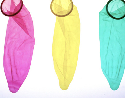
Responsible Americans Poster Design
Being given the task of designing for both sides of a given issue I designed posters for a non-government paid birth control stance. I wanted to be extreme and really make people take a second look at what was going on in the poster. I used colored condoms, pills, and money to express my point. I took pictures of them over a light box to get a sort of medical sterile lighting and to be able to capture all the wrinkles and shadows the condoms created. The point I was making came out clear with attack like force.
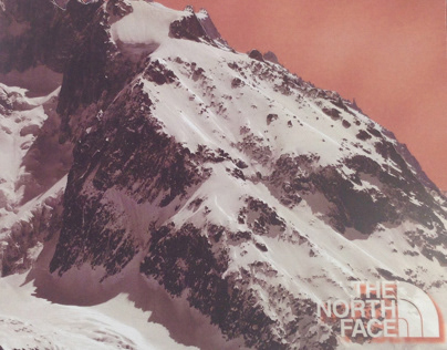
The North Face Annual Report
The North Face is a company that is edgy and goes to the extreme.They needed an annual report that was edgy, bold, and a represented their companied style. I looked at the North Face’s ad, web, and print designs to get inspiration and see how I could incorporate that into mine. I chose a cutout mountain for the cover because their company was started on mountain climbing and they are known for their extreme weather gear. Its all about getting to the top for them and climbing mountains to do it. I used a grid system along with corner marks to map out locations for type and pictures. The corner marks are a play off of the saying, “taking it to the edge”. I wanted sharp corners to give it that feeling. I used fun pictures and sayings to give the annual report the spunk it needed and I separated the sections by color, the signature North Face red being the primary color.

Life in a Suitcase
After moving into my apartment, which was the bottom floor of a very old house, I found a suitcase left behind with all sorts of items. In these items I found a diary of an older woman who used to live there. I decided to make a book about the suitcase and the items in it. I took photographs of all the items in the suitcase and using Photoshop I “burned” the pages written in the diary onto the floor the items were photographed in. I want- ed it to look like the history still lived in the house, like the memories were etched. I sewed the cover to look like the suitcase and give it a personal look.

Seattle brand bible
After having chosen a city and designing a logo for it I was given the task of making a “brand bible” for the city. This was meant to guide the city in how to use the logo and other promotional city items. I designed city car wraps, stationary, business cards, print and web ads, city pole signs, bus and monorail wraps, billboards, knick-knacks, and the logo color and usage guidelines. After designing all of the requirements I put it all in a brand bible that I designed. The book was printed and constructed with recycled paper, and recycled book board. I transfered the front cover using wintergreen oil that also gave it that northwest pine scent.

The Long Rain: An Interpretation
This book was created out of inspiration from the short story, “The Long Rain” by: Ray Bradbury. This is a story of men who have crash landed on Venus on their way to an Earth colony located on Venus. It never stops raining on Venus and there are monsters and natives out to kill them. The men struggle to survive and stay sane as they try to make their way back. I wanted to capture the emotion of the rain that was slowly taking over and controlling the men. I used food dye and took pictures of it in water to show the story turn from hopeful to consumed by death. I used words used the describe the rain and photographed them in water. I then took to Photoshop to make all the pages possible and flow evenly between one another.
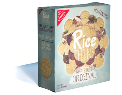
Rice Thins Box Re-Design
Rice Thins is a fairly new product made by Nabisco that sisters the Wheat
Thins product. The original box and logo mirrored the Wheat Thins box and needed to have its own identity. I drew hand done type for the entire box except for using Univers for back and side of the box for easy legibility. I wanted to convey being light, healthy, and fresh. I took scans of the cracker and placed it in a circular pattern almost like a flower. I masked picture of nature over 2 layers of the crackers and put a highlight around it to make it look like it was floating. I made the box an inch short and 1/2” wider to be more hand held and make people feel like its a small easy snack.
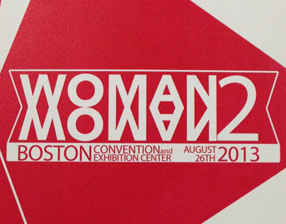
Conference Brochure Design
This project was of a brochure design for a conference. Since the conference was about two sides of an issue coming together I made all the pages visible and a gradient of one color so it portrays seeing all sides like seeing both sides of an issue. The conference was "Woman 2 Woman" so I wanted it to look feminine without being to stereotypical. I used a reddish pink to get the feminine look and an angular design to make it feel strong and bold.